“The titillation factor of the show is striking…”
The other day, I was surprised to read that Nirvana’s Nevermind album was released 20 years ago. Has that much time really gone by since my high school friends and I donned plaid shirts and made moon-eyes at boys playing Nirvana covers in local bands? Gulp. It seemed timely that the latest exhibition at The Art Bar at Toronto’s Gladstone Hotel featured a collective named for a Nirvana song. And it seemed fitting, at least for me personally, that the theme of the collective’s recent photo shoot in Vice magazine, many of whose images are in the show, was crushes.
The international collective Ardorous is spearheaded by eighteen-year-old Petra Collins, an incoming OCADU student. I was eager to catch the show before it closed today, to support young female artists and to see what all the buzz was about. The collective’s first exhibition is called In Bloom. Given my fixation on signifiers of femininity in my own work, I was keen to see a show emphasizing “girly imagery of flowers, hearts and the colour pink” (1). The curatorial statement noted that the show was a “response to what has been ingrained in our hearts as ‘feminine[,]’ which we have chosen to embrace and celebrate.” (2) Not knowing if ‘we’ meant society or the collective, I felt some trepidation. The word ‘celebrate’ had come up recently in another curatorial text, in relation to Alex Prager’s CONTACT installation, and that didn’t sit so well with me. It was unclear whether In Bloom would be a critique of society’s celebration of femininity and be heavy on irony, or if it would simply be a celebration.
The show struck me not as ironic but as—to use 2.0 parlance—WYSIWYG. The soft focus and 1960s-style colour of the photographs make them easy on the eyes, but what defines them as eye candy is the subject matter. The statement for the collective explains the origin of its name beyond its namesake by including the definition of ardour (sexual excitement and a temporary feeling of warmth). The titillation factor of the show is striking: young women in the shower, a young woman’s buttocks poking out of denim shorts, long blond hair brushing against the waistband of a pair of tighty whities, etc. It made me wonder, does placing images of sexy young women in a bar complicate the art viewing experience? There was one gratuitous online comment about the collective that turned my stomach, causing me to doubt whether the combination of alchohol and these images is advisable. Also, in light of the recent controversy surrounding ten-year-old model, Thylane Loubry Blondeau in Paris Vogue, how young is too young for sexy photos? In spite of a risqué reading, there is an earnest quality throughout In Bloom that is a welcome change to the plethora of garish images exploiting sexuality and going viral these days. Perhaps fresh-faced sexuality verges on “girl power” (3) after all, because the young women are controlling their presentation as in classic boudoir photos. ‘Boy of my dreams’ hand-written over the pubic area on floral cotton briefs is far less disturbing than the phrases silkscreened onto store bought underwear; obsessive though it may be, the writer is thinking with her own mind. Or heart. Or libido.
Mostly, however, I’m stumped by how the show portrays girl power, since the artists don’t seem to be fighting any of the restrictions placed on them. The one exception might be a photo by Swedish artist, Emma Arvida Bystorm of a young woman lying on the grass with her hands behind her head, with bright red lips, carefully coiffed hair, and unshaven armpits that buck Western convention. It’s the counterpart to the promotional image by the same artist used for the show: a close-up of a tangerine coloured bikini bottom, with sprawling pubic hairs that must have done wonders for attendance. Its title, Lolita, reveals cultural awareness. A risk of exhibiting at a young age is lacking sufficient artistic/cultural awareness: the image that comes to mind is from a heart-shaped montage of 4 x 6-inch prints without individual artists identified, in which two girls have their hair braided together in a fashion that is disturbingly derivative of Relation in Time (1977) by artist Marina Abramović.
The show was so heavily focused on photography that it would have been stronger with one medium. Ardorous' website takes this approach and feels substantially more cohesive. Besides photographs, In Bloom included a few paintings and multiple floral headbands (the latter caused me to wonder, “Is it art? Is it craft?” without like-minded works to build the case either way). Equally distracting was the Metro article on Collins, which was torn at the edges and attached to the wall in the middle of the show. Most distracting were the permanent botanicals strewn throughout the room, taking the interpretation of the ‘in bloom’ theme too far. The most curious installation of them was in a corner beside the montage of photos: on a pedestal surrounded by devotional candles, it functioned as a makeshift reliquary. On the one hand, it could be regarded as a commentary on the veneration of youth and beauty (which is a bit strange considering the irreverent quality of the show). On the other hand, with business cards on top, it could easily be seen as self-aggrandizement.
(1) (2) (3) Curatorial text by Madelyne Beckles.
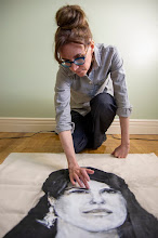
For images, see www.theardorous.com.
Tuesday, August 9, 2011
Subscribe to:
Posts (Atom)