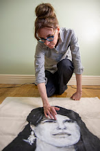
"All my art is erotic, suggestive..." — Lynda Benglis
After working for 15 days straight, I was thrilled to get away on the week-end before starting a new job this week. What does one do with exactly 12 hours in New York, besides feel badly about not having more time for social engagements? Between breakfast in Bryant Park, subway transit toward Coney Island surrounded by 14 matching mermaids, a Trivial Pursuit game at Brooklyn’s Pizza Plus (where, incidentally, I answered the question, “What noted women’s rights activist got married in 2000 in the home of Wilma Mankiller? (1)” correctly, thank-you very much), dinner in Hell’s Kitchen with an artist friend in her last week in the city, and a late night stroll through Greenwich Village, I managed to squeeze in a pit stop to the New Museum with my husband.
It was the closing week-end of Lynda Benglis’ first retrospective exhibition in 20 years, organized by the Irish Museum of Modern Art (Dublin) in collaboration with Van Abbemuseum (Eindhoven). I was familiar with Benglis primarily as a counterpoint to my favourite artist, Hannah Wilke: besides both being Second Wave feminists who poured latex to create sculptures in the spirit of abstract expressionism, referenced Marcel Duchamp in performative work, and appropriated Greek costuming in self-portraiture, they upped the ante of nude self-advertising in lockstep. The culmination was Benglis unwittingly providing Wilke with a venue to undress in protest to Benglis’ infamous Artforum ad; not only was it at her exhibition at Paula Cooper Gallery, but it was at her opening reception (2). When I read this in Nancy Princenthal’s monograph, Hannah Wilke (Prestel, 2010), I sat on my little Ikea couch feeling stunned and somehow betrayed by my idol. Her audacity struck me as the antithesis of how my former colleague from SUNY Purchase, Julian Kreimer, described Benglis’ approach to art making: “respectful irreverence.” (3)
The fact that I have used Kreimer’s quotation out of context to home in on feminism substantiates Emily Nathan’s observation that the importance of concept and form in Benglis’ art are equally weighted (4). It is tempting to have a singular focus, and had I not traipsed through New York in the heat beforehand, I would probably have indulged in finding evidence of Benglis’ insistence that “All my [her] art is erotic, suggestive” (5). I was too fatigued to process innuendo-laden titles like Come (1969-74) for an amorphous floor sculpture until writing this post. So, form it was. The highlight of the amorphous sculptures was Phantom (1971), which has not been exhibited for the past 40 years; I actually exclaimed aloud when I entered a darkened room to find five large glow-in-the-dark sculptures reminiscent of the overlapping blobs and shards of ice that accumulate in Niagara Falls during the winter. As the air conditioning took hold and I moved through the other rooms, I was delighted to discover her wall-hung cocoon sculptures, not least because of my longstanding interest in the convergence of this medium and subject matter. These oblong panels were like cocoons cruelly bisected to reveal interlocking slick shapes in colours evocative of—strangely enough—gummy worms. In my state of probable dehydration, I fixated on these interlocking forms with each new piece, especially in the huge monocrhomatic abstract forms that deviated from the cocoon shape entirely. With no obvious focal point, they become an invitation to let the viewer’s eyes dance around the surface, which was a trance I welcomed. Although I was not in a position to make the most of this show, I was reminded that seeing work in person is always worthwhile, to appreciate some element that eludes reproductions. For me, this eureka moment was spawned by the cast lead version of the same double-headed dildo that divided the Artforum editors in 1974 when Benglis straddled it naked, save for a pair of sunglasses. Seeing nails positioned ever so precariously around the semicircular shaft to keep it in place, I couldn’t help but smile, which is fitting since that is the name of the piece.
For images, see the New Museum.
(1) Answer: Gloria Steinem.
(2) This intervention in New York in 1975 was entitled Invasion Performance.
(3) Kreimer, Julian. “Shape Shifter: Lynda Benglis”. Art in America. 12/1/09, pp. 95-101.Quotation ¶5.
(4) Nathan, Emily. "Lynda Benglis: Top Form". Artnet. February 11, 2011.
(5) Seiberling, Dorothy. “The New Sexual Frankness: Good-by to Hearts and Flowers”. New York Magazine, 8 (7), pp. 37-44. Quotation p. 42.
Showing posts with label artist. Show all posts
Showing posts with label artist. Show all posts
Monday, June 20, 2011

Saturday, May 21, 2011
Alex Prager in CONTACT
"Her allure, in my opinion, lay not in the femme fatale reference..."
Well, Judgment Day has not yet ensued as predicted and the dire hour of 6 pm has passed. Even if it happens tonight, I can regale the world with at least one more blog post in this final hour.
My husband and I headed to Toronto the other night to catch Alex Prager’s installation, curated by Bonnie Rubenstein, in the Scotiabank CONTACT Photography Festival. The Week-End series features panels and billboards of women evocative of a by-gone era of cinema. These staged photographs of starlets and femme fatales reportedly celebrate the “trappings of femininity” (1), which—big surprise—caught my attention. Without actually referencing Baudrillard's concept of the simulacrum, the artist's statement mentions the victory of female-generated illusions over reality. Irony is a tricky business, as the image Four Girls (2007, not included in this particular installation) demonstrates: the central figure is shot from below with her back to viewers, tantalizing them in a string bikini top and bottoms wedged to emphasize the contours of her buttocks. Rubenstein isn’t kidding when she writes that it’s difficult to see beyond these facades. It’s no wonder Prager’s voyeuristic style has occasionally been misinterpreted as that of a male artist, undoubtedly reinforced by her gender-neutral name.
The previous CONTACT exhibition I saw was Suzy Lake: Political Poetics, a retrospective curated by Matthew Brower and Carla Garnet at the University of Toronto Art Centre. After seeing her seminal works, notably On Stage, in which she plays dress-up and vamps for the camera, I paused at the entrance of Prager’s installation to consider the novelty of her female figures. The curatorial text notes Prager’s examination of cinematic tropes; after seeing Lake’s performative photos made before Prager was even born, I had a hard time not seeing them as tropes within tropes. Or, as more simply put by one commenter on the MoMA blog in response to Prager's inclusion in the group show, New Photography, 2010: “How is this new photography?” (2) What overcame my misgivings was the simple act of walking through the site and appreciating the photographs in an urban landscape.
When I read that Prager’s installation was at the site of a former drive-in theatre (3), although this was not confirmed by the curatorial text, I grasped the role of nostalgia in appreciating the work. I have maybe one memory of attending a drive-in, so that’s not a source of nostalgia I can tap into personally. In fact, I think my generation takes movies for granted. (This past week, I started watching one movie a day while embroidering and found myself feeling shortchanged because there were no outtakes on the DVD of Gray Matters I rented and that I couldn’t get the extended version of Forgetting Sarah Marshall to play on a rental the day before. Also, I once teased my frightened mother when we watched The Birds--one of the films to which Prager has paid homage--because I was reared on superior special effects...though my reaction might differ now after a recent Hitchcock-style attack from a red-winged blackbird I experienced at the Port Credit harbour). Today, I was reminded of the power of movies while I was waiting for film to be developed at Photo Metro in North Bay. I started reading George Tremblay’s book, Break at Nine! (4), about the author’s career as a projectionist. The opening chapter recounted his receipt of a red ticket at elementary school in 1935 for the first film he ever saw; how his classmate missed out on the perfect seats because he ran down the aisle and slipped; how the author got so excited he stood up on his chair and bonked his head. It wasn’t just the film itself, but the entire experience, that rocked his world. The same is true of installations and it would be unfair to assess Prager’s work as stand-alone photographs when they are part of a curious setting.
The film I had developed contained images of Prager’s work in situ to jog my memory while writing this post. As I pulled out my camera to snap a two-dimensional, glamorous redhead behind a three-dimensional dumpster, a neighbour scowled at me and later, a man on a rooftop patio yelled, “I wouldn’t do that if I were you” (I imagine I have misremembered his proper use of the subjunctive). I wasn’t operating outside Ontario law, so I was perplexed about what was so infuriating. The patio man got his wish because my film ran out before the final image I encountered of a female figure in profile called Barbara (2009). Her blond locks, heavily lined lids and fur coat channeled Marilyn Monroe and Edie Sedgwick. Her allure, in my opinion, lay not in the femme fatale reference, but rather in the combination of high and low contrast, and I'm not referring to darkroom technique. Like the redhead behind the dumpster, her image competed with an urban setting, namely graffiti in the lower right corner. At the same time, its beige-grey colour morphed seamlessly into the fur of her coat, tarnishing her glamour. (These and other images can be seen here).My favourites were the works that functioned like chameleons in the environment, like Lois (2009), the buxom blond amidst broken down cars above vehicles at an actual dealership/autobody shop; and a woman descending a red brick building via a rope, installed, fittingly, on a red brick building (below).
I found myself—to borrow wording from Dermot Wilson’s exhibition that I was glad to catch today at Art on Main in North Bay (5)—embracing the faux. Something he wrote about his own nostalgic works resonated with me when I thought back on Prager’s installation: “We’re immersed in the ersatz. So why not incorporate it into our visions of the landscape?” I suppressed my feminist impulses and decided to give Prager a break in spite of her scant artist statement and her rather pedestrian description of her artistic concept in live interviews, which could otherwise do wonders to defend her visually appealing work. Today, it turns out, is not Judgment Day.
(1) Curatorial text.
(2) Tim (last name unknown). http://www.moma.org/explore/inside_out/2010/11/15/alex-prager-in-new-photography-2010/#more-10287
(2) http://mrwillw.blogspot.com/2011/04/los-angeles-native-alex-prager.html
(3) George Tremblay, Break at Nine: Presenting Those Wonderful Movies!, 2001, Ontario Film Laboratories. Full disclosure: he is one of my inlaws.
(4) Dermot Wilson, Embracing the Foe, May 2-25, 2011, Art on Main, North Bay, ON.
Well, Judgment Day has not yet ensued as predicted and the dire hour of 6 pm has passed. Even if it happens tonight, I can regale the world with at least one more blog post in this final hour.
My husband and I headed to Toronto the other night to catch Alex Prager’s installation, curated by Bonnie Rubenstein, in the Scotiabank CONTACT Photography Festival. The Week-End series features panels and billboards of women evocative of a by-gone era of cinema. These staged photographs of starlets and femme fatales reportedly celebrate the “trappings of femininity” (1), which—big surprise—caught my attention. Without actually referencing Baudrillard's concept of the simulacrum, the artist's statement mentions the victory of female-generated illusions over reality. Irony is a tricky business, as the image Four Girls (2007, not included in this particular installation) demonstrates: the central figure is shot from below with her back to viewers, tantalizing them in a string bikini top and bottoms wedged to emphasize the contours of her buttocks. Rubenstein isn’t kidding when she writes that it’s difficult to see beyond these facades. It’s no wonder Prager’s voyeuristic style has occasionally been misinterpreted as that of a male artist, undoubtedly reinforced by her gender-neutral name.
The previous CONTACT exhibition I saw was Suzy Lake: Political Poetics, a retrospective curated by Matthew Brower and Carla Garnet at the University of Toronto Art Centre. After seeing her seminal works, notably On Stage, in which she plays dress-up and vamps for the camera, I paused at the entrance of Prager’s installation to consider the novelty of her female figures. The curatorial text notes Prager’s examination of cinematic tropes; after seeing Lake’s performative photos made before Prager was even born, I had a hard time not seeing them as tropes within tropes. Or, as more simply put by one commenter on the MoMA blog in response to Prager's inclusion in the group show, New Photography, 2010: “How is this new photography?” (2) What overcame my misgivings was the simple act of walking through the site and appreciating the photographs in an urban landscape.
When I read that Prager’s installation was at the site of a former drive-in theatre (3), although this was not confirmed by the curatorial text, I grasped the role of nostalgia in appreciating the work. I have maybe one memory of attending a drive-in, so that’s not a source of nostalgia I can tap into personally. In fact, I think my generation takes movies for granted. (This past week, I started watching one movie a day while embroidering and found myself feeling shortchanged because there were no outtakes on the DVD of Gray Matters I rented and that I couldn’t get the extended version of Forgetting Sarah Marshall to play on a rental the day before. Also, I once teased my frightened mother when we watched The Birds--one of the films to which Prager has paid homage--because I was reared on superior special effects...though my reaction might differ now after a recent Hitchcock-style attack from a red-winged blackbird I experienced at the Port Credit harbour). Today, I was reminded of the power of movies while I was waiting for film to be developed at Photo Metro in North Bay. I started reading George Tremblay’s book, Break at Nine! (4), about the author’s career as a projectionist. The opening chapter recounted his receipt of a red ticket at elementary school in 1935 for the first film he ever saw; how his classmate missed out on the perfect seats because he ran down the aisle and slipped; how the author got so excited he stood up on his chair and bonked his head. It wasn’t just the film itself, but the entire experience, that rocked his world. The same is true of installations and it would be unfair to assess Prager’s work as stand-alone photographs when they are part of a curious setting.
The film I had developed contained images of Prager’s work in situ to jog my memory while writing this post. As I pulled out my camera to snap a two-dimensional, glamorous redhead behind a three-dimensional dumpster, a neighbour scowled at me and later, a man on a rooftop patio yelled, “I wouldn’t do that if I were you” (I imagine I have misremembered his proper use of the subjunctive). I wasn’t operating outside Ontario law, so I was perplexed about what was so infuriating. The patio man got his wish because my film ran out before the final image I encountered of a female figure in profile called Barbara (2009). Her blond locks, heavily lined lids and fur coat channeled Marilyn Monroe and Edie Sedgwick. Her allure, in my opinion, lay not in the femme fatale reference, but rather in the combination of high and low contrast, and I'm not referring to darkroom technique. Like the redhead behind the dumpster, her image competed with an urban setting, namely graffiti in the lower right corner. At the same time, its beige-grey colour morphed seamlessly into the fur of her coat, tarnishing her glamour. (These and other images can be seen here).My favourites were the works that functioned like chameleons in the environment, like Lois (2009), the buxom blond amidst broken down cars above vehicles at an actual dealership/autobody shop; and a woman descending a red brick building via a rope, installed, fittingly, on a red brick building (below).

I found myself—to borrow wording from Dermot Wilson’s exhibition that I was glad to catch today at Art on Main in North Bay (5)—embracing the faux. Something he wrote about his own nostalgic works resonated with me when I thought back on Prager’s installation: “We’re immersed in the ersatz. So why not incorporate it into our visions of the landscape?” I suppressed my feminist impulses and decided to give Prager a break in spite of her scant artist statement and her rather pedestrian description of her artistic concept in live interviews, which could otherwise do wonders to defend her visually appealing work. Today, it turns out, is not Judgment Day.
(1) Curatorial text.
(2) Tim (last name unknown). http://www.moma.org/explore/inside_out/2010/11/15/alex-prager-in-new-photography-2010/#more-10287
(2) http://mrwillw.blogspot.com/2011/04/los-angeles-native-alex-prager.html
(3) George Tremblay, Break at Nine: Presenting Those Wonderful Movies!, 2001, Ontario Film Laboratories. Full disclosure: he is one of my inlaws.
(4) Dermot Wilson, Embracing the Foe, May 2-25, 2011, Art on Main, North Bay, ON.
Thursday, March 24, 2011
Erin Finley at Hallwalls Contemporary Arts Center
"...as Andy Warhol told the Velvet Underground..."
I shuffled off to Buffalo on Friday to hear an artist talk by Erin Finley that coincided with the opening of her exhibition at Hallwalls. The show consists of “knockout drawings” featuring “coyly transgressive subjects,” to borrow curator John Massier’s wording. He described the act of seeing her work in person during a studio visit as startling, because reproductions couldn’t do them justice. One could imagine that he was referring to the teeny narratives surrounding the main action, which are rendered intricately with a cartographer’s pen. Or maybe he was thinking of the glint of light hitting a sparkly baby Jesus atop Marlon Brando’s head or on a glittering Louis Vuitton sandal in a self-portrait of the artist with maxipad wings exposed.

What I recall most vividly from visiting Finley’s Calgary studio and later, her present Toronto studio, was the denseness of imagery cluttering the walls. Early 80s Madonna hung alongside an oversized colouring book picture of Alice in Wonderland and across from a leaflet for the theatre production of Legally Blonde that Finley picked up while exhibiting at CBGBs. It was as if she had gorged on popular culture and hurled onto the wall, where her entire visual schemata was seeping into the works created below. Thus, it was fitting that she began her artist talk with an overview of images that inform her current work, which ranged from Miley Cyrus with her pants around her ankles to documentation of torture in Guantánamo Bay.
The content of her irreverent drawings makes them au courant, yet they possess a timeless quality by virtue of their style. There are several artists that come to mind whose purposeful disregard for drawing conventions makes them easily confused for one another; this aesthetic, however suited to quirky subject matter, runs the risk of a pressing expiration date. Finley’s deftly drawn and equally imaginative works stand in contrast. It doesn’t hurt that she inserts references to art history, like Borromini’s architecture, Mannerist proportions, and Greco-Roman stories, situating her work firmly in the realm of art and preventing it from being confused with children’s book illustrations like the work of some of her artist contemporaries.
 In the context of this blog, I would be remiss to discuss Finley’s work without tackling the prickly issue of feminism, for she is a self-described feminist. At best, feminism is a contentious issue, but it is even more so with her work. A case in point: Rape fantasy (2010) features a scraggly haired girl lying on the ground while reading a short story of the same name by Margaret Atwood. Though her back is arched and her naked bottom is thrust in the air like a cat, she appears absolutely in control. The toe of her running shoe digs into the ground, giving her the ability to sprint away if need be. Her male-like torso, devoid of cleavage, is suggestive of superheroism, conjuring images of Buffy the Vampire Slayer slamming a classmate’s head into the steering wheel when he makes a pass at her after locking the door against her will. There are numerous representations of androgyny in the exhibition, notably in self-portraits, which address the malleability of gender head-on. At first glance, works like Portrait of the artist as a suicide bomber (2010) may seem aggressive and not just because of connotations of terrorism. However, she credits children’s literature as a source for this so-called magical imagery. This perspective casts them in a tender light and reminds us of the endless possibilities that exist in children’s minds before they place limitations on themselves because of gender. And, just as androgyny avoids prescriptive behaviour, so does a portrait of two men kissing, Simon + Jimmy (2007), which she showed in her presentation. Finley noted that the viewer does not watch them perversely. If anyone is the voyeur, it is the birds and the bees in the background, which underscores the naturalness of this encounter. Her inclusiveness of queer sexuality and her prevention of voyeurism are ultimately feminist.
 At the end of her talk, I asked what her barometer was for gauging whether her subjects were too lukewarm or too far-gone, expecting a self-conscious answer (like wanting to provoke a reaction from family members but not wanting to hide the work from them). Instead, she had the perfect quotation on the tip of her tongue that fused art history with pop culture: as Andy Warhol told the Velvet Underground, “Always leave them wanting less.”
Click images to enlarge; courtesy of the artist:
Portrait of the artist in Louis Vuitton and maxi pad with wings / black and metallic ink on paper / 2011
Portrait of the artist as a suicide bomber / ink on paper / 2010
Simon + Jimmy / Chalk, pencil, cosmetic blush, oil paint on paper / 2007
I shuffled off to Buffalo on Friday to hear an artist talk by Erin Finley that coincided with the opening of her exhibition at Hallwalls. The show consists of “knockout drawings” featuring “coyly transgressive subjects,” to borrow curator John Massier’s wording. He described the act of seeing her work in person during a studio visit as startling, because reproductions couldn’t do them justice. One could imagine that he was referring to the teeny narratives surrounding the main action, which are rendered intricately with a cartographer’s pen. Or maybe he was thinking of the glint of light hitting a sparkly baby Jesus atop Marlon Brando’s head or on a glittering Louis Vuitton sandal in a self-portrait of the artist with maxipad wings exposed.

What I recall most vividly from visiting Finley’s Calgary studio and later, her present Toronto studio, was the denseness of imagery cluttering the walls. Early 80s Madonna hung alongside an oversized colouring book picture of Alice in Wonderland and across from a leaflet for the theatre production of Legally Blonde that Finley picked up while exhibiting at CBGBs. It was as if she had gorged on popular culture and hurled onto the wall, where her entire visual schemata was seeping into the works created below. Thus, it was fitting that she began her artist talk with an overview of images that inform her current work, which ranged from Miley Cyrus with her pants around her ankles to documentation of torture in Guantánamo Bay.
The content of her irreverent drawings makes them au courant, yet they possess a timeless quality by virtue of their style. There are several artists that come to mind whose purposeful disregard for drawing conventions makes them easily confused for one another; this aesthetic, however suited to quirky subject matter, runs the risk of a pressing expiration date. Finley’s deftly drawn and equally imaginative works stand in contrast. It doesn’t hurt that she inserts references to art history, like Borromini’s architecture, Mannerist proportions, and Greco-Roman stories, situating her work firmly in the realm of art and preventing it from being confused with children’s book illustrations like the work of some of her artist contemporaries.
 In the context of this blog, I would be remiss to discuss Finley’s work without tackling the prickly issue of feminism, for she is a self-described feminist. At best, feminism is a contentious issue, but it is even more so with her work. A case in point: Rape fantasy (2010) features a scraggly haired girl lying on the ground while reading a short story of the same name by Margaret Atwood. Though her back is arched and her naked bottom is thrust in the air like a cat, she appears absolutely in control. The toe of her running shoe digs into the ground, giving her the ability to sprint away if need be. Her male-like torso, devoid of cleavage, is suggestive of superheroism, conjuring images of Buffy the Vampire Slayer slamming a classmate’s head into the steering wheel when he makes a pass at her after locking the door against her will. There are numerous representations of androgyny in the exhibition, notably in self-portraits, which address the malleability of gender head-on. At first glance, works like Portrait of the artist as a suicide bomber (2010) may seem aggressive and not just because of connotations of terrorism. However, she credits children’s literature as a source for this so-called magical imagery. This perspective casts them in a tender light and reminds us of the endless possibilities that exist in children’s minds before they place limitations on themselves because of gender. And, just as androgyny avoids prescriptive behaviour, so does a portrait of two men kissing, Simon + Jimmy (2007), which she showed in her presentation. Finley noted that the viewer does not watch them perversely. If anyone is the voyeur, it is the birds and the bees in the background, which underscores the naturalness of this encounter. Her inclusiveness of queer sexuality and her prevention of voyeurism are ultimately feminist.
 At the end of her talk, I asked what her barometer was for gauging whether her subjects were too lukewarm or too far-gone, expecting a self-conscious answer (like wanting to provoke a reaction from family members but not wanting to hide the work from them). Instead, she had the perfect quotation on the tip of her tongue that fused art history with pop culture: as Andy Warhol told the Velvet Underground, “Always leave them wanting less.”
 Click images to enlarge; courtesy of the artist:
Portrait of the artist in Louis Vuitton and maxi pad with wings / black and metallic ink on paper / 2011
Portrait of the artist as a suicide bomber / ink on paper / 2010
Simon + Jimmy / Chalk, pencil, cosmetic blush, oil paint on paper / 2007
Thursday, March 17, 2011
Mona Hatoum at the Power Plant
“I’m interested in trauma,” she said, but not in “point[ing] a finger at the source of the trauma.”
Having gone a year and a half without making a cocoon sculpture until recently, I had to dig out some old artist statements and remind myself what they used to mean to me. The crux of the engagement has always been in establishing a contrast between seducing and repelling the viewer, a tendency I hadn’t heard another artist talk about at great length until Tuesday night. When feminist artist Mona Hatoum spoke at the Power Plant in Toronto, this was a strategy she referenced repeatedly.
Hatoum explained that she stumbled upon the combination of fear and fascination with her installation work, much of which recontextualizes familiar objects. One method of recontextualizing is playing with scale in sculpture, making for highly accessible works to even the most novice viewers. For example, La Grande Broyeuse depicts a food grinder, and looks enchantingly quirky (somewhat like a creature designed by Tim Burton, towering over the viewer). Similarly, a massive cheese grater (Grater Divide) has an appealing smooth, shiny surface. It would be easy to pass these works off as derivative of Claes Oldenburg’s oversized familiar objects rendered in soft sculpture if it weren’t for their menacing connotations. The grater’s protrusions and the grinder’s capacity to fit more than a morsel of food are disturbing indeed. Collectively, they create the sensation of a domestic environment that is no safer than the turbulent world outside, but does that reading stem from the fact that she is a woman representing objects from the kitchen, and from her personal history as a transnational artist born in Beirut to a Palestinian family? The question period at the end of her talk made it clear that she defies essentialist readings.
After taking a semester in Sheridan’s Crafts + Design program this past fall, I was particularly taken by Hatoum’s forays into the realm of craft: a historical map of Palsetine embroidered in hair on a pillowcase is as haunting as her grenades made of coloured glass. Sometimes it’s not the object itself that creates the push and pull of repulsion and seduction, but its positioning, whether it’s a series of barbed wires dangling above the ground precariously, or a world map made on the floor with marbles that threaten to dislocate. The latter work she described as possessing a “double aspect of fragility and danger.”
Although the “internal contradictions” she mentioned could be seen as referring to works that contain this duality, Hatoum actually used the term in relation to viewers. This concept is apparent in her description of the work, Incommunicado, a cradle with a base of cheese wires stretched across; she noted that you could view it from the perspective of the victim or the abuser. I feel an affinity with this work in particular, as I spend a lot of time scouring second hand stores for baby clothing for my art. The kind of objectivity Hatoum demonstrates eludes me personally, as I seem fixated on the victim’s stance when making art. “I’m interested in trauma,” she said, but not in “point[ing] a finger at the source of the trauma.” Again, I felt a little stuck in my ways when I heard that, as I am an unabashed finger pointer. It will be interesting to see if this open-mindedness will come with time. Perhaps the lesson I should leave with is that balance is key. A visual reminder of that lesson is Plus and Minus. She described this kinetic work, which creates and destroys lines as it rotates, as opposites co-existing side by side. It also seems like a fabulous metaphor for art history (and Hatoum did concede that she likes to make art historical references in her work). Art history is not a neat and tidy additive process. Maybe it doesn’t matter if one artist’s approach is different from another artist’s approach, whether it’s Oldenburg in relation to Hatoum or Hatoum in relation to this blogger. Their legacy is in the traces.
Please see http://www.whitecube.com/artists/hatoum/viii/ for images.
Saturday, January 15, 2011
An unforgettable project
“…it makes Masik look like she is audaciously aligning herself with the victims, or that she is regrettably obtuse.”
Yesterday was the first I had heard about Vancouver-based Pamela Masik’s large-scale painted portraits of 69 missing and murdered women from Vancouver’s Downtown Eastside (six of whose gruesome fates are attributed to convicted killer, Robert Pickton). Tomas Jonsson alerted me to the fact that the MOA, formerly the Museum of Anthropology, announced on January 12 that it would not be exhibiting Masik’s series on the University of British Columbia campus next month as planned. As I climbed into bed shuddering, my mind went to three divergent places: (1) to the public library I worked at as a teenager, where the head librarian decided against buying a book by a murderer because she wanted to deny royalties, though my mother counters that it was a biography of, not by, a murderer; (2) to my third year of art school, when a classmate with no apparent personal association to cancer made a piece about breast cancer, undoubtedly requiring incredible composure from our teacher—a breast cancer survivor—to not react personally; and (3) to the movie, Art School Confidential, in which the main character passes off portraits of murder victims as his own, ultimately implicating himself in their deaths because the actual artist created them as trophies containing incriminating evidence. What’s the point of my scattered reaction? Tackling this subject matter is likely to get an artist in hot water, and highly sensitive subject matter of any kind may be impossible for a public institution to contend with and for anyone personally involved to accept. My interest is in the artist’s approach to her work, not in that of the MOA (for my thoughts on censorship at art museums, click here).
In short, Masik has been criticized for being the spokesperson for marginalized communities she has limited experience with, and exploiting their memories for personal gain without adequate consultation with the victims’ families. Her side of the story is that someone needs to speak up about women going missing; that she is in a position to speak for them—as a woman’s shelter volunteer, as their neighbour, and as a woman; and that she has respected the wishes of family members, many of whom were touched by the memorial.*
I didn’t want to lash out against a fellow female artist unduly, so I read her website thoroughly along with each of her 80-plus blog posts, determined to understand her point of view. My objectivity was shaken almost instantly when I read her description of herself as a prolific national treasure in the making. This self-aggrandizing continued with her characterization of The Forgotten Project (the series in question) as ‘hauntingly beautiful’ and other paintings as ‘stunning.’ With this degree of confidence, it seems almost inevitable that she would have great expectations for a series that took nearly five years to create. Indeed, she wrote in August 2009 that there would be no denying The Forgotten Project. The MOA cancellation would have come as quite the shock, then, especially after the series garnered attention during the Olympics. At the same time, it’s not like there is no precedence in this arena: take, for instance, Marlene McCarthy’s Murder Girls series (also massive portraits, but in this case, of matricidal adolescents) which her former gallery would not show in 1995, causing a three-year lag before they were exhibited elsewhere.
Masik has been taken to task by writers like Meghan Murphy (The F Word) and Francisco-Fernando Granados (FUSE) for posing in front of these portraits, creating a gut-wrenching contrast to the battered women. Indeed, she is featured in exactly one-third of the 39 images in the photo gallery on the website, www.theforgotten.ca. Thirty years ago, it might just be her beauty that would offend (think Hannah Wilke), but today’s pluralistic feminism accounts for race, socioeconomic status, sexual orientation, etc.—factors other than strictly gender. According to her critics, Masik is cut from a different cloth than the victimized women. Thus, the juxtaposition of her against their faces stings.
Whether the posing is out of arrogant pride, sincere attachment, or a combination of the two, cannot be known. Reading her blog posts, I did notice a deep attachment to the portraits. Not only does she personify her paintbrush (Mar. 14, 2010) but she seems unable to separate the paintings from herself (“I was the brushstroke”, Jan. 10, 2009; “The paintings become me”, Nov. 11, 2008). She also has a history of including herself in her work, both in performance art, and in her paintings. When she unveiled a portion of The Forgotten Project in her studio, the promotional material mentioned a painting from another series that shows her naked body with pornographic (her phrasing) undertones. Given that sex trade workers are among the victims in The Forgotten Project, imagine the chilling reaction of loved ones. Also imagine the reaction to Masik detailing the physical wear and tear of making the series—her bleeding fingers, torn rotator cuff, and ‘broken’ body. Surely what she is implying is that she has poured herself into the series, but stating it in that manner makes Masik look like she is audaciously aligning herself with the victims, or that she is obtuse. When she laments the lost opportunity to say good-bye to the first painting from the series to be exhibited as it was crated and sent off to an art fair, it strikes me the same way. A more direct and abrasive attempt at empathy is her insistence that she “know(s) the pain and suffering” (June 27, 2009) of the victims’ loved ones. But someone who is grieving or empathetic wouldn’t compare herself to a child awaiting Christmas morning (Sept. 11, 2009). When she calls Pickton an opportunist (Feb. 15, 2010)**, it’s hard not to balk at the irony of her wording.
*For background reading on the controversy, see The Province, FUSE,
dpi, and The F Word.
**From the video, The Forgotten Project (Chris Morrow). All other dates in parentheses refer to Masik’s blog posts.
Sunday, January 2, 2011
Correspondence Course
“…these exchanges…serve as reminders of the messiness of autobiographical art making. For instance, a film about Schneemann’s lover is screened well after the marriage has ended…”
Three notes about myself: (1) I am of the age that I barely remember carbon paper (from having not-for-profit art jobs at offices equipped with outdated credit card machines, and before that, from my father’s high school biology exams recycled for scrap paper. “What should you do if someone has a heart attack?” one asked. A precocious child, I scribbled, “Call the hospital.”) (2) I consider myself lucky to be part of the final generation to know the joys of giving and receiving hand-written letters, a practice I upheld well into the email era (with no one more than my librarian friend, Laura Wray). (3) I am at an early enough point in my art career that I can forgive myself for not retaining all of my related correspondence, though I vowed redemption after reading of Marina Abramović’s thorough archive in When Marina Abramović Dies (James Wescott, MIT Press, 2010).
In spite of my relatively unblackened fingers, my support of the postal system, and my librarian-archivist values, I am—how shall I say—bewildered? awed? inspired? by the simple strategy employed by artist Carolee Schneemann. She has preserved each and every outgoing letter in carbon copy as well as the letters she has received, providing a stunning overview of her career as it moved beyond painting to encompass feminist film and performance incorporating her body*. A goldmine for researchers not only for its source material but also for its footnotes, Correspondence Course (Duke University Press, 2010) is a selection of these letters from 1956 to 1999 excerpted by art historian Kristine Stiles. As a recreational reader, I wondered how much I would gain from reading the letters since the introduction does such a good job of distilling the next 490 pages.
If you fancy yourself to be a grammarian, prepare yourself for Schneemann’s unconventional approach to writing. In fact, consider pouring yourself a glass of wine. Initially, I was perplexed by Schneemann’s liberties with language, such as nouns shoved together and not in a legit, noun cluster kind of way. Once I gave in to the impulse to skim, however, I quite enjoyed creative liberties like “$till between jobs” (p. 373). You get a strong sense of Schneemann’s artistry permeating her language, especially in correspondence with former students with whom greater convention would be expected. Her effusive writing is, in a word (ahem), refreshing in the academic context. The letters to and from her peers range from mutual encouragement to necessary clarifications. (Admittedly, it’s great to see a woman standing up for herself in an articulate, if occasionally abrasive, manner). They demonstrate the importance of what may seem to be clichéd advice given to aspiring artists, that it is prudent to ‘get out there’ and establish a network. Her frankness about difficult issues like finances may also serve emerging artists well, so they understand the choices involved in an art career. Unsolicited mail from artists inspired by Schneemann is also noteworthy, demonstrating her worth beyond awards bestowed from the top-down.
Schneemann’s letters to lovers are engaging, especially their poetic language. There are passages I read and reread to make sense of them—to determine, for example, if she was referring to the recipient or a new lover (i.e., a third party). I was strangely satisfied with the inconclusive nature of it all. It reminded me of the whispered ending of the movie, Lost in Translation, when Bob (Bill Murray) bids farewell to a tearful Charlotte (Scarlett Johansson): we aren’t privy to the details of what is said, and what can be imagined is more powerful. In the same way that an effective work of art does not provide all of the answers, Schneemann’s writing is open to interpretation, and os sometimes entertainingly blatant in its double entendres. Also striking about these exchanges is that they serve as reminders of the messiness of autobiographical art making. For instance, a film about Schneemann’s lover is screened well after the marriage has ended, which she accepts graciously. With the passage of time, these letters also emphasize the ability of romantic love to survive in a new form (Schneemann’s letters to her first ex-husband are particularly touching in this regard). Her descriptions of her beloved cats also underscore the myriad kinds of love that exist.
That Schneemann kept copies of the letters she sent begs the question of whether she may have had one eye on the future the entire time. That is to say, on a subconscious level, did she construct herself differently knowing that someone other than the primary reader might someday judge her? Who is to say? What I do believe is that there is a synergism to the collection, especially when the parties comment on the impact of receiving the previous letter or the joy it brings them to write the next installment. The whole of Stiles' Correspondence Course is more than the sum of its parts.
*Note: I am reticent to summarize her career in a single sentence, so please, read the book.
Subscribe to:
Posts (Atom)