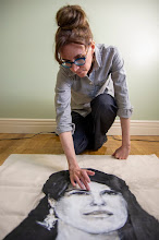
“The titillation factor of the show is striking…”
The other day, I was surprised to read that Nirvana’s Nevermind album was released 20 years ago. Has that much time really gone by since my high school friends and I donned plaid shirts and made moon-eyes at boys playing Nirvana covers in local bands? Gulp. It seemed timely that the latest exhibition at The Art Bar at Toronto’s Gladstone Hotel featured a collective named for a Nirvana song. And it seemed fitting, at least for me personally, that the theme of the collective’s recent photo shoot in Vice magazine, many of whose images are in the show, was crushes.
The international collective Ardorous is spearheaded by eighteen-year-old Petra Collins, an incoming OCADU student. I was eager to catch the show before it closed today, to support young female artists and to see what all the buzz was about. The collective’s first exhibition is called In Bloom. Given my fixation on signifiers of femininity in my own work, I was keen to see a show emphasizing “girly imagery of flowers, hearts and the colour pink” (1). The curatorial statement noted that the show was a “response to what has been ingrained in our hearts as ‘feminine[,]’ which we have chosen to embrace and celebrate.” (2) Not knowing if ‘we’ meant society or the collective, I felt some trepidation. The word ‘celebrate’ had come up recently in another curatorial text, in relation to Alex Prager’s CONTACT installation, and that didn’t sit so well with me. It was unclear whether In Bloom would be a critique of society’s celebration of femininity and be heavy on irony, or if it would simply be a celebration.
The show struck me not as ironic but as—to use 2.0 parlance—WYSIWYG. The soft focus and 1960s-style colour of the photographs make them easy on the eyes, but what defines them as eye candy is the subject matter. The statement for the collective explains the origin of its name beyond its namesake by including the definition of ardour (sexual excitement and a temporary feeling of warmth). The titillation factor of the show is striking: young women in the shower, a young woman’s buttocks poking out of denim shorts, long blond hair brushing against the waistband of a pair of tighty whities, etc. It made me wonder, does placing images of sexy young women in a bar complicate the art viewing experience? There was one gratuitous online comment about the collective that turned my stomach, causing me to doubt whether the combination of alchohol and these images is advisable. Also, in light of the recent controversy surrounding ten-year-old model, Thylane Loubry Blondeau in Paris Vogue, how young is too young for sexy photos? In spite of a risqué reading, there is an earnest quality throughout In Bloom that is a welcome change to the plethora of garish images exploiting sexuality and going viral these days. Perhaps fresh-faced sexuality verges on “girl power” (3) after all, because the young women are controlling their presentation as in classic boudoir photos. ‘Boy of my dreams’ hand-written over the pubic area on floral cotton briefs is far less disturbing than the phrases silkscreened onto store bought underwear; obsessive though it may be, the writer is thinking with her own mind. Or heart. Or libido.
Mostly, however, I’m stumped by how the show portrays girl power, since the artists don’t seem to be fighting any of the restrictions placed on them. The one exception might be a photo by Swedish artist, Emma Arvida Bystorm of a young woman lying on the grass with her hands behind her head, with bright red lips, carefully coiffed hair, and unshaven armpits that buck Western convention. It’s the counterpart to the promotional image by the same artist used for the show: a close-up of a tangerine coloured bikini bottom, with sprawling pubic hairs that must have done wonders for attendance. Its title, Lolita, reveals cultural awareness. A risk of exhibiting at a young age is lacking sufficient artistic/cultural awareness: the image that comes to mind is from a heart-shaped montage of 4 x 6-inch prints without individual artists identified, in which two girls have their hair braided together in a fashion that is disturbingly derivative of Relation in Time (1977) by artist Marina Abramović.
The show was so heavily focused on photography that it would have been stronger with one medium. Ardorous' website takes this approach and feels substantially more cohesive. Besides photographs, In Bloom included a few paintings and multiple floral headbands (the latter caused me to wonder, “Is it art? Is it craft?” without like-minded works to build the case either way). Equally distracting was the Metro article on Collins, which was torn at the edges and attached to the wall in the middle of the show. Most distracting were the permanent botanicals strewn throughout the room, taking the interpretation of the ‘in bloom’ theme too far. The most curious installation of them was in a corner beside the montage of photos: on a pedestal surrounded by devotional candles, it functioned as a makeshift reliquary. On the one hand, it could be regarded as a commentary on the veneration of youth and beauty (which is a bit strange considering the irreverent quality of the show). On the other hand, with business cards on top, it could easily be seen as self-aggrandizement.
(1) (2) (3) Curatorial text by Madelyne Beckles.
For images, see www.theardorous.com.
Tuesday, August 9, 2011

Friday, July 29, 2011
Nolite te bastardes carborundorum (Don’t let the bastards grind you down)*
“...it’s difficult to bottom line a library.”
I can’t call myself a Torontonian without reservation: I was raised in a rural village two hours away and I only spend five days a week downtown for work. Cumulatively, however, I have had a Toronto address for exactly half of my adult life. Thus, I can relate to the swell of Toronto pride this week, apparent in others’ conversations and social media comments about “my [their] city.” It’s a direct response to the new era defined by the mayorship of Rob Ford.
Threats to close Toronto Public Library branches alarmed the masses, causing concerned citizens to camp out during the 24 hour City Council meeting. The concern is over what is at stake but also over the cavalier attitude that accompanies the push towards privatization. Rob Ford’s elder brother, Coun. Doug Ford, noted that his Scarborough neighbourhood has more libraries than Tim Hortons—as if the two are mutually exclusive? My hometown, incidentally, went for years without a Tim Hortons but I think if the library were missing, it would leave a gaping hole.
Celebrated author Margaret Atwood became the unofficial spokesperson for the fight to save TPL. Her alliances with the library world have been apparent for years, notably in her presentation at an American Library Association conference. At any rate, she appealed to fans through her Twitter feed on several occasions to sign an online petition. The surge of John Hancocks actually crashed the TPL Workers Union server, and at last count, I heard there were 39,000 signatures. On Tuesday, Coun. Doug Ford retorted that he didn’t know Atwood and wouldn’t even recognize her. Yet, this is a woman whose portrait has been painted by Charles Pachter. I can picture the low-brow response: Q-Who’s Charles Pachter? If he walked right past me, I wouldn’t recognize him. A-Oh bother! He painted the Queen. There you have it, Atwood is in line with the Queen…not in line to be Queen, but she is Canadian literary royalty, with a stunning 21 honourary degrees and myriad awards including the Giller Prize, the Booker Prize, and the Governor General’s Award. Even Indigo Chapters have acknowledged her heavyweight status by knocking 30 per cent off all Atwood titles until the end of July when customers present a Canadian library card.
It was at my hometown library that I first made my way through the entire Atwood collection. Some of her sentences are such zingers that I would read them repeatedly before moving on, taking forever to finish a book. I wasn’t always a prolific reader. With great embarrassment, I remember being at the same library for preschool story hour and trying to convince a friend I knew how to read by mimicking silent reading. I knew reading was cool, and beyond that, it was empowering. How did I know that? Because I watched my mother do literacy tutoring with an adult at the library, something I did myself years later with not-for-profit organizations. (If it doesn’t break your heart to learn that illiterate adults get by in Toronto by doing things like memorizing the colours and murals at TTC subway stops, then society is doomed and we can congratulate Atwood on her dystopian visionary powers, revealed in such classics as The Handmaid’s Tale). I actually watched an adaptation of this book by the Canadian Opera Company, which you might argue is an economic benefit to Toronto of me having used a public library in Ontario years earlier. Do you think City Council would buy that as an argument for the butterfly effect?
Ultimately, it’s difficult to bottom line a library. The fact that my hometown library gave me my first art show and gave me an alternative to working in the tobacco industry for five years? Priceless. The impact of helping a user with a dictionary to decipher a letter from an employer? Priceless. Of helping a senior use a computer? Priceless. Of helping an adult read? Actually, you probably can put a price on that if you consider the increased employability of the individual.
Every story I’ve read about last night’s meeting quotes the same 67-year-old woman. Mary Trapani Hynes proposed that Toronto obliterate the public library system altogether, since the burdens of a politically aware and literate community are too great. Now that’s satire, Atwood style.
*From The Handmaid’s Tale, McClelland & Stewart, Houghton Mifflin, 1985.
For background on the proposed cuts, which will be followed up in September, click here.
I can’t call myself a Torontonian without reservation: I was raised in a rural village two hours away and I only spend five days a week downtown for work. Cumulatively, however, I have had a Toronto address for exactly half of my adult life. Thus, I can relate to the swell of Toronto pride this week, apparent in others’ conversations and social media comments about “my [their] city.” It’s a direct response to the new era defined by the mayorship of Rob Ford.
Threats to close Toronto Public Library branches alarmed the masses, causing concerned citizens to camp out during the 24 hour City Council meeting. The concern is over what is at stake but also over the cavalier attitude that accompanies the push towards privatization. Rob Ford’s elder brother, Coun. Doug Ford, noted that his Scarborough neighbourhood has more libraries than Tim Hortons—as if the two are mutually exclusive? My hometown, incidentally, went for years without a Tim Hortons but I think if the library were missing, it would leave a gaping hole.
Celebrated author Margaret Atwood became the unofficial spokesperson for the fight to save TPL. Her alliances with the library world have been apparent for years, notably in her presentation at an American Library Association conference. At any rate, she appealed to fans through her Twitter feed on several occasions to sign an online petition. The surge of John Hancocks actually crashed the TPL Workers Union server, and at last count, I heard there were 39,000 signatures. On Tuesday, Coun. Doug Ford retorted that he didn’t know Atwood and wouldn’t even recognize her. Yet, this is a woman whose portrait has been painted by Charles Pachter. I can picture the low-brow response: Q-Who’s Charles Pachter? If he walked right past me, I wouldn’t recognize him. A-Oh bother! He painted the Queen. There you have it, Atwood is in line with the Queen…not in line to be Queen, but she is Canadian literary royalty, with a stunning 21 honourary degrees and myriad awards including the Giller Prize, the Booker Prize, and the Governor General’s Award. Even Indigo Chapters have acknowledged her heavyweight status by knocking 30 per cent off all Atwood titles until the end of July when customers present a Canadian library card.
It was at my hometown library that I first made my way through the entire Atwood collection. Some of her sentences are such zingers that I would read them repeatedly before moving on, taking forever to finish a book. I wasn’t always a prolific reader. With great embarrassment, I remember being at the same library for preschool story hour and trying to convince a friend I knew how to read by mimicking silent reading. I knew reading was cool, and beyond that, it was empowering. How did I know that? Because I watched my mother do literacy tutoring with an adult at the library, something I did myself years later with not-for-profit organizations. (If it doesn’t break your heart to learn that illiterate adults get by in Toronto by doing things like memorizing the colours and murals at TTC subway stops, then society is doomed and we can congratulate Atwood on her dystopian visionary powers, revealed in such classics as The Handmaid’s Tale). I actually watched an adaptation of this book by the Canadian Opera Company, which you might argue is an economic benefit to Toronto of me having used a public library in Ontario years earlier. Do you think City Council would buy that as an argument for the butterfly effect?
Ultimately, it’s difficult to bottom line a library. The fact that my hometown library gave me my first art show and gave me an alternative to working in the tobacco industry for five years? Priceless. The impact of helping a user with a dictionary to decipher a letter from an employer? Priceless. Of helping a senior use a computer? Priceless. Of helping an adult read? Actually, you probably can put a price on that if you consider the increased employability of the individual.
Every story I’ve read about last night’s meeting quotes the same 67-year-old woman. Mary Trapani Hynes proposed that Toronto obliterate the public library system altogether, since the burdens of a politically aware and literate community are too great. Now that’s satire, Atwood style.
*From The Handmaid’s Tale, McClelland & Stewart, Houghton Mifflin, 1985.
For background on the proposed cuts, which will be followed up in September, click here.
Saturday, July 16, 2011
Artists in transit: Riding the rails with Galerie du Nouvel-Ontario
“Art in Motion…involved 30 artists travelling from Sudbury to Chapleau…”
Back in May 2009, I chose the title and concept of my blog on a whim and started the next day without a plan. As an artist-commuter, I wanted to write about my artistic experiences and influences in the context of transit. Over time, it became taxing to tie art and transit together creatively, but I still cherish the moments when they converge and present a potential hook for a new post. For instance, two days ago on the Go train out of Toronto, I was reading the Shout Outs in the t.o.night newspaper when I saw this compliment paid from one Go train passenger to another: “When Botticelli painted, he was dreaming of you.” Ha!


Images: Making a flip book (top), Arriving in Chapleau, ON (bottom)
By far, the best pairing of art and transit since I began blogging has been the residency and exhibition I participated in today with members of Galerie du Nouvel-Ontario. The theme was Art in Motion and involved 30 artists traveling from Sudbury (almost 5 hours northwest of where I live) to Chapleau (an additional five hours in the same direction). It's hard to believe it takes 10 hours to get from Mississauga to Mississagi River. I knew we were going into the great beyond when my cell phone lost service, and it sure felt off the grid when we reached our final destination and there was no Tim Hortons in sight. We travelled by Via Rail, making art en route from a Budd car. The scenery was spectacular and the ride was smooth—a relaxing combination conducive to art making, though my concept was actually rooted in tension.
I deviated from my usual practice of feminist fibre art and made a flip book called Les mots que je comprend (The Words that I Understand), based on snippets of French conversations surrounding me. I’ve been interested in the social element of language learning ever since I taught ESL after art school. Recently, I’ve been reflecting on the isolating nature of language—in preparation for a presentation at the International Conference on Image and Imagery at Brock University with the theme, Silence and the Silenced, I’ve been making sculptures with baby clothing containing perplexing statements like ‘Dangerously Cute,’ ‘I Heart Shoes,’ and ‘Gentil gamin, je suis très chic’ that speak for pre-literate girls. Back to the piece at hand, I was interested in the social experience of an Anglophone artist (me) amongst Francophone artists (including my husband), since I’m interested in the concept of the Other in general in my work. I wanted to capture the experience of being in transit and taking in conversations in a foreign language, where my impulse is to fixate on a familiar term until leapfrogging to the next one. The end result is a bit like poetry. I chose the flip book format because of its dependence on motion and its easy fit with the theme. Rather than creating an animated image, I opted for a nonsensical blur with overlapping words in keeping with the anxiety of FSL. I keep thinking if it were an instructional piece by Yoko Ono, it would go something like this: Ride a train in a foreign culture. Write a word you hear on each page of a small book. Watch the words fly. Serendipitously, the word I recorded on the final page of my notebook was ‘encore’; it was the perfect segue to volume 2, which I plan to make on the return trip tomorrow and display at the second Art in Motion exhibition at the train station in Sudbury.
Artists came from as far as Ottawa, Cochrane, and Thunder Bay and explored an impressive range of media: sculpture, works on paper, photography, film, relational performance, storytelling, poetry, and music. At the debut of the works tonight at Aux Trois Moulins Motel where we stayed, I lost at Bingo, got fingerprinted, and was implicated in a murder mystery (the last two were unrelated), but it was still a great day. À demain!
Back in May 2009, I chose the title and concept of my blog on a whim and started the next day without a plan. As an artist-commuter, I wanted to write about my artistic experiences and influences in the context of transit. Over time, it became taxing to tie art and transit together creatively, but I still cherish the moments when they converge and present a potential hook for a new post. For instance, two days ago on the Go train out of Toronto, I was reading the Shout Outs in the t.o.night newspaper when I saw this compliment paid from one Go train passenger to another: “When Botticelli painted, he was dreaming of you.” Ha!


Images: Making a flip book (top), Arriving in Chapleau, ON (bottom)
By far, the best pairing of art and transit since I began blogging has been the residency and exhibition I participated in today with members of Galerie du Nouvel-Ontario. The theme was Art in Motion and involved 30 artists traveling from Sudbury (almost 5 hours northwest of where I live) to Chapleau (an additional five hours in the same direction). It's hard to believe it takes 10 hours to get from Mississauga to Mississagi River. I knew we were going into the great beyond when my cell phone lost service, and it sure felt off the grid when we reached our final destination and there was no Tim Hortons in sight. We travelled by Via Rail, making art en route from a Budd car. The scenery was spectacular and the ride was smooth—a relaxing combination conducive to art making, though my concept was actually rooted in tension.
I deviated from my usual practice of feminist fibre art and made a flip book called Les mots que je comprend (The Words that I Understand), based on snippets of French conversations surrounding me. I’ve been interested in the social element of language learning ever since I taught ESL after art school. Recently, I’ve been reflecting on the isolating nature of language—in preparation for a presentation at the International Conference on Image and Imagery at Brock University with the theme, Silence and the Silenced, I’ve been making sculptures with baby clothing containing perplexing statements like ‘Dangerously Cute,’ ‘I Heart Shoes,’ and ‘Gentil gamin, je suis très chic’ that speak for pre-literate girls. Back to the piece at hand, I was interested in the social experience of an Anglophone artist (me) amongst Francophone artists (including my husband), since I’m interested in the concept of the Other in general in my work. I wanted to capture the experience of being in transit and taking in conversations in a foreign language, where my impulse is to fixate on a familiar term until leapfrogging to the next one. The end result is a bit like poetry. I chose the flip book format because of its dependence on motion and its easy fit with the theme. Rather than creating an animated image, I opted for a nonsensical blur with overlapping words in keeping with the anxiety of FSL. I keep thinking if it were an instructional piece by Yoko Ono, it would go something like this: Ride a train in a foreign culture. Write a word you hear on each page of a small book. Watch the words fly. Serendipitously, the word I recorded on the final page of my notebook was ‘encore’; it was the perfect segue to volume 2, which I plan to make on the return trip tomorrow and display at the second Art in Motion exhibition at the train station in Sudbury.
Artists came from as far as Ottawa, Cochrane, and Thunder Bay and explored an impressive range of media: sculpture, works on paper, photography, film, relational performance, storytelling, poetry, and music. At the debut of the works tonight at Aux Trois Moulins Motel where we stayed, I lost at Bingo, got fingerprinted, and was implicated in a murder mystery (the last two were unrelated), but it was still a great day. À demain!
Monday, June 20, 2011
Lynda Benglis at the New Museum
"All my art is erotic, suggestive..." — Lynda Benglis
After working for 15 days straight, I was thrilled to get away on the week-end before starting a new job this week. What does one do with exactly 12 hours in New York, besides feel badly about not having more time for social engagements? Between breakfast in Bryant Park, subway transit toward Coney Island surrounded by 14 matching mermaids, a Trivial Pursuit game at Brooklyn’s Pizza Plus (where, incidentally, I answered the question, “What noted women’s rights activist got married in 2000 in the home of Wilma Mankiller? (1)” correctly, thank-you very much), dinner in Hell’s Kitchen with an artist friend in her last week in the city, and a late night stroll through Greenwich Village, I managed to squeeze in a pit stop to the New Museum with my husband.
It was the closing week-end of Lynda Benglis’ first retrospective exhibition in 20 years, organized by the Irish Museum of Modern Art (Dublin) in collaboration with Van Abbemuseum (Eindhoven). I was familiar with Benglis primarily as a counterpoint to my favourite artist, Hannah Wilke: besides both being Second Wave feminists who poured latex to create sculptures in the spirit of abstract expressionism, referenced Marcel Duchamp in performative work, and appropriated Greek costuming in self-portraiture, they upped the ante of nude self-advertising in lockstep. The culmination was Benglis unwittingly providing Wilke with a venue to undress in protest to Benglis’ infamous Artforum ad; not only was it at her exhibition at Paula Cooper Gallery, but it was at her opening reception (2). When I read this in Nancy Princenthal’s monograph, Hannah Wilke (Prestel, 2010), I sat on my little Ikea couch feeling stunned and somehow betrayed by my idol. Her audacity struck me as the antithesis of how my former colleague from SUNY Purchase, Julian Kreimer, described Benglis’ approach to art making: “respectful irreverence.” (3)
The fact that I have used Kreimer’s quotation out of context to home in on feminism substantiates Emily Nathan’s observation that the importance of concept and form in Benglis’ art are equally weighted (4). It is tempting to have a singular focus, and had I not traipsed through New York in the heat beforehand, I would probably have indulged in finding evidence of Benglis’ insistence that “All my [her] art is erotic, suggestive” (5). I was too fatigued to process innuendo-laden titles like Come (1969-74) for an amorphous floor sculpture until writing this post. So, form it was. The highlight of the amorphous sculptures was Phantom (1971), which has not been exhibited for the past 40 years; I actually exclaimed aloud when I entered a darkened room to find five large glow-in-the-dark sculptures reminiscent of the overlapping blobs and shards of ice that accumulate in Niagara Falls during the winter. As the air conditioning took hold and I moved through the other rooms, I was delighted to discover her wall-hung cocoon sculptures, not least because of my longstanding interest in the convergence of this medium and subject matter. These oblong panels were like cocoons cruelly bisected to reveal interlocking slick shapes in colours evocative of—strangely enough—gummy worms. In my state of probable dehydration, I fixated on these interlocking forms with each new piece, especially in the huge monocrhomatic abstract forms that deviated from the cocoon shape entirely. With no obvious focal point, they become an invitation to let the viewer’s eyes dance around the surface, which was a trance I welcomed. Although I was not in a position to make the most of this show, I was reminded that seeing work in person is always worthwhile, to appreciate some element that eludes reproductions. For me, this eureka moment was spawned by the cast lead version of the same double-headed dildo that divided the Artforum editors in 1974 when Benglis straddled it naked, save for a pair of sunglasses. Seeing nails positioned ever so precariously around the semicircular shaft to keep it in place, I couldn’t help but smile, which is fitting since that is the name of the piece.
For images, see the New Museum.
(1) Answer: Gloria Steinem.
(2) This intervention in New York in 1975 was entitled Invasion Performance.
(3) Kreimer, Julian. “Shape Shifter: Lynda Benglis”. Art in America. 12/1/09, pp. 95-101.Quotation ¶5.
(4) Nathan, Emily. "Lynda Benglis: Top Form". Artnet. February 11, 2011.
(5) Seiberling, Dorothy. “The New Sexual Frankness: Good-by to Hearts and Flowers”. New York Magazine, 8 (7), pp. 37-44. Quotation p. 42.
After working for 15 days straight, I was thrilled to get away on the week-end before starting a new job this week. What does one do with exactly 12 hours in New York, besides feel badly about not having more time for social engagements? Between breakfast in Bryant Park, subway transit toward Coney Island surrounded by 14 matching mermaids, a Trivial Pursuit game at Brooklyn’s Pizza Plus (where, incidentally, I answered the question, “What noted women’s rights activist got married in 2000 in the home of Wilma Mankiller? (1)” correctly, thank-you very much), dinner in Hell’s Kitchen with an artist friend in her last week in the city, and a late night stroll through Greenwich Village, I managed to squeeze in a pit stop to the New Museum with my husband.
It was the closing week-end of Lynda Benglis’ first retrospective exhibition in 20 years, organized by the Irish Museum of Modern Art (Dublin) in collaboration with Van Abbemuseum (Eindhoven). I was familiar with Benglis primarily as a counterpoint to my favourite artist, Hannah Wilke: besides both being Second Wave feminists who poured latex to create sculptures in the spirit of abstract expressionism, referenced Marcel Duchamp in performative work, and appropriated Greek costuming in self-portraiture, they upped the ante of nude self-advertising in lockstep. The culmination was Benglis unwittingly providing Wilke with a venue to undress in protest to Benglis’ infamous Artforum ad; not only was it at her exhibition at Paula Cooper Gallery, but it was at her opening reception (2). When I read this in Nancy Princenthal’s monograph, Hannah Wilke (Prestel, 2010), I sat on my little Ikea couch feeling stunned and somehow betrayed by my idol. Her audacity struck me as the antithesis of how my former colleague from SUNY Purchase, Julian Kreimer, described Benglis’ approach to art making: “respectful irreverence.” (3)
The fact that I have used Kreimer’s quotation out of context to home in on feminism substantiates Emily Nathan’s observation that the importance of concept and form in Benglis’ art are equally weighted (4). It is tempting to have a singular focus, and had I not traipsed through New York in the heat beforehand, I would probably have indulged in finding evidence of Benglis’ insistence that “All my [her] art is erotic, suggestive” (5). I was too fatigued to process innuendo-laden titles like Come (1969-74) for an amorphous floor sculpture until writing this post. So, form it was. The highlight of the amorphous sculptures was Phantom (1971), which has not been exhibited for the past 40 years; I actually exclaimed aloud when I entered a darkened room to find five large glow-in-the-dark sculptures reminiscent of the overlapping blobs and shards of ice that accumulate in Niagara Falls during the winter. As the air conditioning took hold and I moved through the other rooms, I was delighted to discover her wall-hung cocoon sculptures, not least because of my longstanding interest in the convergence of this medium and subject matter. These oblong panels were like cocoons cruelly bisected to reveal interlocking slick shapes in colours evocative of—strangely enough—gummy worms. In my state of probable dehydration, I fixated on these interlocking forms with each new piece, especially in the huge monocrhomatic abstract forms that deviated from the cocoon shape entirely. With no obvious focal point, they become an invitation to let the viewer’s eyes dance around the surface, which was a trance I welcomed. Although I was not in a position to make the most of this show, I was reminded that seeing work in person is always worthwhile, to appreciate some element that eludes reproductions. For me, this eureka moment was spawned by the cast lead version of the same double-headed dildo that divided the Artforum editors in 1974 when Benglis straddled it naked, save for a pair of sunglasses. Seeing nails positioned ever so precariously around the semicircular shaft to keep it in place, I couldn’t help but smile, which is fitting since that is the name of the piece.
For images, see the New Museum.
(1) Answer: Gloria Steinem.
(2) This intervention in New York in 1975 was entitled Invasion Performance.
(3) Kreimer, Julian. “Shape Shifter: Lynda Benglis”. Art in America. 12/1/09, pp. 95-101.Quotation ¶5.
(4) Nathan, Emily. "Lynda Benglis: Top Form". Artnet. February 11, 2011.
(5) Seiberling, Dorothy. “The New Sexual Frankness: Good-by to Hearts and Flowers”. New York Magazine, 8 (7), pp. 37-44. Quotation p. 42.
Saturday, May 21, 2011
Alex Prager in CONTACT
"Her allure, in my opinion, lay not in the femme fatale reference..."
Well, Judgment Day has not yet ensued as predicted and the dire hour of 6 pm has passed. Even if it happens tonight, I can regale the world with at least one more blog post in this final hour.
My husband and I headed to Toronto the other night to catch Alex Prager’s installation, curated by Bonnie Rubenstein, in the Scotiabank CONTACT Photography Festival. The Week-End series features panels and billboards of women evocative of a by-gone era of cinema. These staged photographs of starlets and femme fatales reportedly celebrate the “trappings of femininity” (1), which—big surprise—caught my attention. Without actually referencing Baudrillard's concept of the simulacrum, the artist's statement mentions the victory of female-generated illusions over reality. Irony is a tricky business, as the image Four Girls (2007, not included in this particular installation) demonstrates: the central figure is shot from below with her back to viewers, tantalizing them in a string bikini top and bottoms wedged to emphasize the contours of her buttocks. Rubenstein isn’t kidding when she writes that it’s difficult to see beyond these facades. It’s no wonder Prager’s voyeuristic style has occasionally been misinterpreted as that of a male artist, undoubtedly reinforced by her gender-neutral name.
The previous CONTACT exhibition I saw was Suzy Lake: Political Poetics, a retrospective curated by Matthew Brower and Carla Garnet at the University of Toronto Art Centre. After seeing her seminal works, notably On Stage, in which she plays dress-up and vamps for the camera, I paused at the entrance of Prager’s installation to consider the novelty of her female figures. The curatorial text notes Prager’s examination of cinematic tropes; after seeing Lake’s performative photos made before Prager was even born, I had a hard time not seeing them as tropes within tropes. Or, as more simply put by one commenter on the MoMA blog in response to Prager's inclusion in the group show, New Photography, 2010: “How is this new photography?” (2) What overcame my misgivings was the simple act of walking through the site and appreciating the photographs in an urban landscape.
When I read that Prager’s installation was at the site of a former drive-in theatre (3), although this was not confirmed by the curatorial text, I grasped the role of nostalgia in appreciating the work. I have maybe one memory of attending a drive-in, so that’s not a source of nostalgia I can tap into personally. In fact, I think my generation takes movies for granted. (This past week, I started watching one movie a day while embroidering and found myself feeling shortchanged because there were no outtakes on the DVD of Gray Matters I rented and that I couldn’t get the extended version of Forgetting Sarah Marshall to play on a rental the day before. Also, I once teased my frightened mother when we watched The Birds--one of the films to which Prager has paid homage--because I was reared on superior special effects...though my reaction might differ now after a recent Hitchcock-style attack from a red-winged blackbird I experienced at the Port Credit harbour). Today, I was reminded of the power of movies while I was waiting for film to be developed at Photo Metro in North Bay. I started reading George Tremblay’s book, Break at Nine! (4), about the author’s career as a projectionist. The opening chapter recounted his receipt of a red ticket at elementary school in 1935 for the first film he ever saw; how his classmate missed out on the perfect seats because he ran down the aisle and slipped; how the author got so excited he stood up on his chair and bonked his head. It wasn’t just the film itself, but the entire experience, that rocked his world. The same is true of installations and it would be unfair to assess Prager’s work as stand-alone photographs when they are part of a curious setting.
The film I had developed contained images of Prager’s work in situ to jog my memory while writing this post. As I pulled out my camera to snap a two-dimensional, glamorous redhead behind a three-dimensional dumpster, a neighbour scowled at me and later, a man on a rooftop patio yelled, “I wouldn’t do that if I were you” (I imagine I have misremembered his proper use of the subjunctive). I wasn’t operating outside Ontario law, so I was perplexed about what was so infuriating. The patio man got his wish because my film ran out before the final image I encountered of a female figure in profile called Barbara (2009). Her blond locks, heavily lined lids and fur coat channeled Marilyn Monroe and Edie Sedgwick. Her allure, in my opinion, lay not in the femme fatale reference, but rather in the combination of high and low contrast, and I'm not referring to darkroom technique. Like the redhead behind the dumpster, her image competed with an urban setting, namely graffiti in the lower right corner. At the same time, its beige-grey colour morphed seamlessly into the fur of her coat, tarnishing her glamour. (These and other images can be seen here).My favourites were the works that functioned like chameleons in the environment, like Lois (2009), the buxom blond amidst broken down cars above vehicles at an actual dealership/autobody shop; and a woman descending a red brick building via a rope, installed, fittingly, on a red brick building (below).
I found myself—to borrow wording from Dermot Wilson’s exhibition that I was glad to catch today at Art on Main in North Bay (5)—embracing the faux. Something he wrote about his own nostalgic works resonated with me when I thought back on Prager’s installation: “We’re immersed in the ersatz. So why not incorporate it into our visions of the landscape?” I suppressed my feminist impulses and decided to give Prager a break in spite of her scant artist statement and her rather pedestrian description of her artistic concept in live interviews, which could otherwise do wonders to defend her visually appealing work. Today, it turns out, is not Judgment Day.
(1) Curatorial text.
(2) Tim (last name unknown). http://www.moma.org/explore/inside_out/2010/11/15/alex-prager-in-new-photography-2010/#more-10287
(2) http://mrwillw.blogspot.com/2011/04/los-angeles-native-alex-prager.html
(3) George Tremblay, Break at Nine: Presenting Those Wonderful Movies!, 2001, Ontario Film Laboratories. Full disclosure: he is one of my inlaws.
(4) Dermot Wilson, Embracing the Foe, May 2-25, 2011, Art on Main, North Bay, ON.
Well, Judgment Day has not yet ensued as predicted and the dire hour of 6 pm has passed. Even if it happens tonight, I can regale the world with at least one more blog post in this final hour.
My husband and I headed to Toronto the other night to catch Alex Prager’s installation, curated by Bonnie Rubenstein, in the Scotiabank CONTACT Photography Festival. The Week-End series features panels and billboards of women evocative of a by-gone era of cinema. These staged photographs of starlets and femme fatales reportedly celebrate the “trappings of femininity” (1), which—big surprise—caught my attention. Without actually referencing Baudrillard's concept of the simulacrum, the artist's statement mentions the victory of female-generated illusions over reality. Irony is a tricky business, as the image Four Girls (2007, not included in this particular installation) demonstrates: the central figure is shot from below with her back to viewers, tantalizing them in a string bikini top and bottoms wedged to emphasize the contours of her buttocks. Rubenstein isn’t kidding when she writes that it’s difficult to see beyond these facades. It’s no wonder Prager’s voyeuristic style has occasionally been misinterpreted as that of a male artist, undoubtedly reinforced by her gender-neutral name.
The previous CONTACT exhibition I saw was Suzy Lake: Political Poetics, a retrospective curated by Matthew Brower and Carla Garnet at the University of Toronto Art Centre. After seeing her seminal works, notably On Stage, in which she plays dress-up and vamps for the camera, I paused at the entrance of Prager’s installation to consider the novelty of her female figures. The curatorial text notes Prager’s examination of cinematic tropes; after seeing Lake’s performative photos made before Prager was even born, I had a hard time not seeing them as tropes within tropes. Or, as more simply put by one commenter on the MoMA blog in response to Prager's inclusion in the group show, New Photography, 2010: “How is this new photography?” (2) What overcame my misgivings was the simple act of walking through the site and appreciating the photographs in an urban landscape.
When I read that Prager’s installation was at the site of a former drive-in theatre (3), although this was not confirmed by the curatorial text, I grasped the role of nostalgia in appreciating the work. I have maybe one memory of attending a drive-in, so that’s not a source of nostalgia I can tap into personally. In fact, I think my generation takes movies for granted. (This past week, I started watching one movie a day while embroidering and found myself feeling shortchanged because there were no outtakes on the DVD of Gray Matters I rented and that I couldn’t get the extended version of Forgetting Sarah Marshall to play on a rental the day before. Also, I once teased my frightened mother when we watched The Birds--one of the films to which Prager has paid homage--because I was reared on superior special effects...though my reaction might differ now after a recent Hitchcock-style attack from a red-winged blackbird I experienced at the Port Credit harbour). Today, I was reminded of the power of movies while I was waiting for film to be developed at Photo Metro in North Bay. I started reading George Tremblay’s book, Break at Nine! (4), about the author’s career as a projectionist. The opening chapter recounted his receipt of a red ticket at elementary school in 1935 for the first film he ever saw; how his classmate missed out on the perfect seats because he ran down the aisle and slipped; how the author got so excited he stood up on his chair and bonked his head. It wasn’t just the film itself, but the entire experience, that rocked his world. The same is true of installations and it would be unfair to assess Prager’s work as stand-alone photographs when they are part of a curious setting.
The film I had developed contained images of Prager’s work in situ to jog my memory while writing this post. As I pulled out my camera to snap a two-dimensional, glamorous redhead behind a three-dimensional dumpster, a neighbour scowled at me and later, a man on a rooftop patio yelled, “I wouldn’t do that if I were you” (I imagine I have misremembered his proper use of the subjunctive). I wasn’t operating outside Ontario law, so I was perplexed about what was so infuriating. The patio man got his wish because my film ran out before the final image I encountered of a female figure in profile called Barbara (2009). Her blond locks, heavily lined lids and fur coat channeled Marilyn Monroe and Edie Sedgwick. Her allure, in my opinion, lay not in the femme fatale reference, but rather in the combination of high and low contrast, and I'm not referring to darkroom technique. Like the redhead behind the dumpster, her image competed with an urban setting, namely graffiti in the lower right corner. At the same time, its beige-grey colour morphed seamlessly into the fur of her coat, tarnishing her glamour. (These and other images can be seen here).My favourites were the works that functioned like chameleons in the environment, like Lois (2009), the buxom blond amidst broken down cars above vehicles at an actual dealership/autobody shop; and a woman descending a red brick building via a rope, installed, fittingly, on a red brick building (below).

I found myself—to borrow wording from Dermot Wilson’s exhibition that I was glad to catch today at Art on Main in North Bay (5)—embracing the faux. Something he wrote about his own nostalgic works resonated with me when I thought back on Prager’s installation: “We’re immersed in the ersatz. So why not incorporate it into our visions of the landscape?” I suppressed my feminist impulses and decided to give Prager a break in spite of her scant artist statement and her rather pedestrian description of her artistic concept in live interviews, which could otherwise do wonders to defend her visually appealing work. Today, it turns out, is not Judgment Day.
(1) Curatorial text.
(2) Tim (last name unknown). http://www.moma.org/explore/inside_out/2010/11/15/alex-prager-in-new-photography-2010/#more-10287
(2) http://mrwillw.blogspot.com/2011/04/los-angeles-native-alex-prager.html
(3) George Tremblay, Break at Nine: Presenting Those Wonderful Movies!, 2001, Ontario Film Laboratories. Full disclosure: he is one of my inlaws.
(4) Dermot Wilson, Embracing the Foe, May 2-25, 2011, Art on Main, North Bay, ON.
Thursday, April 14, 2011
J. Crew ad signals apparent end of civilization as we know it
…the fate of the human race hangs in the balance if enough little boys opt for pink nail polish…
The blogosphere has been rife with outrage about Dr. Keith Ablow’s scathing assessment on Monday of a J. Crew ad released last week (1). In his Fox News column (2), he lambastes their president and creative director, Jenna Lyons, for painting her son, Beckett’s toenails hot pink (the five year old’s favourite colour, according to the ad). He laments that “almost nothing is now honored as real and true” (¶4), meaning prescriptive gender behaviour. However, what is real and true is that the boy loves pink. Ablow has his fair share of supporters, with some calling it gross and others declaring with homophobic certainty, “He will be gay.” With so many arguments already articulated against this perspective, I don’t want to be redundant. At the same time, I feel the need to weigh in since my art is about gender as a social construct, with a focus on youth and the connection between pink and femininity/sexuality.
At face value, the issue is the painting of his toenails, and that is Ablow’s point of departure. To be fair, last year, I expressed dismay at Shiloh Jolie-Pitt being baited to have her nails painted (3). Where our opinions diverge radically, though, is in my championing of her right to agency, and by extension, of Beckett’s right to agency. Based on his smile, we can tell he adores bonding with his mom in this way and is not being forced into it.
Ablow associates nail painting with costuming, and expresses concern about the slippery slope of dress-up. He writes about girls being sexualized at a frighteningly young age through clothing. I agree with that perspective. However, Beckett’s navy pants and striped sailor shirt, reminiscent of Pablo Picasso or Jackson Pollock’s attire, don’t belie femininity (not that I would find that problematic, personally). What seems to be the real issue is marking his body with pink, which amounts to a form of social labeling, or to be more academic, social semiotics/semantics. (I am fascinated by the extent of this labeling: I picked up a shirt in Chicago recently for my art that says repeatedly—like a mantra—“I love pink.” It’s for a one year old).
Are polished nails really a signifier of sexuality? I’ve been rewatching My So-Called Life lately, in which Rickie Vasquez, a groundbreaking gay television character, first experiments with makeup and later comes out. Positive correlation? Arbitrary connection? Who is to say? Even the prospect of the former is enough to make Ablow take a number of staggering leaps. He implies that the fate of the human race hangs in the balance if enough little boys opt for pink nail polish and don’t grow up to fulfill their biological duty. Then again, if, as he says, girls are being less cautious sexually these days, the imbalance would balance, wouldn’t it? He also questions whether the next step will be manipulating race by changing skin colour. OK, then.
Why is pink such a contentious colour, anyway? Veronika Koller’s study, “Not Just a Color: Pink as a Gender and Sexuality Marker in Visual Communication” showed that women associate pink with femininity and positive attributes, but men mostly regard it as neutral. For instance, 45.3 percent of women thought pink was alluring, compared to 23.9 percent of men (4). Extrapolating from this study, one could assume that Beckett is unaffected in any substantial way. Still, Ablow insists money should be put aside for the child’s inevitable therapy. That seems about as likely as someone needing therapy because their parents posted naked photos of them as a baby on Facebook (as one of the followers of my blog did just yesterday).
Ablow wants to “hold dear anything with which we were born” (¶8). His birth date, from what I can tell from online sources, is 1961, a mere two decades after the approximated reversal of the pink/blue trend. That is to say, pink used to be the colour of men and boys, as it was associated with the colour of blood and war. So, when Ablow imagines a future where “neither gender is motivated to protect the nation by marching into combat against other men and risking their lives” (¶10), I am inclined to disagree. At any rate, blue used to be the colour of women and girls. It was linked to the Virgin Mary, and it became a colour of morality during the Protestant Reformation (5). Bottom line? Society is fickle. If we’re talking about time-honoured tradition, I’d argue that little Beckett has a classic sense of fashion.
We would do well to update Simone de Beauvoir’s statement, “One is not born, but rather becomes, a woman” to “One is not born, but rather becomes, intolerant.”
Sources:
(1) Copy and paste this link, as it does not seem to link to this blog:
http://www.jcrew.com/womens_feature/Jennaspicks.jsp
(2) Ablow, K. J. Crew Plants the Seeds for Gender Identity.
http://www.foxnews.com/health/2011/04/11/j-crew-plants-seeds-
gender-identity/
(3) Copy and paste this link, as it does not seem to link to this blog: http://artistintransit.blogspot.com/2010/03/shiloh-parsing-out-
celebrity-fashion.html/
(4) Pastroureau, M. Blue: The History of a Color. 2001. Princeton University Press.
(5) Koller, V. Not just a color: pink as a gender and sexuality marker in visual communication. 2008, November. Vol. 7, No. 4. Visual Communication. Doi: 10.1177/1470357208096209.
The blogosphere has been rife with outrage about Dr. Keith Ablow’s scathing assessment on Monday of a J. Crew ad released last week (1). In his Fox News column (2), he lambastes their president and creative director, Jenna Lyons, for painting her son, Beckett’s toenails hot pink (the five year old’s favourite colour, according to the ad). He laments that “almost nothing is now honored as real and true” (¶4), meaning prescriptive gender behaviour. However, what is real and true is that the boy loves pink. Ablow has his fair share of supporters, with some calling it gross and others declaring with homophobic certainty, “He will be gay.” With so many arguments already articulated against this perspective, I don’t want to be redundant. At the same time, I feel the need to weigh in since my art is about gender as a social construct, with a focus on youth and the connection between pink and femininity/sexuality.
At face value, the issue is the painting of his toenails, and that is Ablow’s point of departure. To be fair, last year, I expressed dismay at Shiloh Jolie-Pitt being baited to have her nails painted (3). Where our opinions diverge radically, though, is in my championing of her right to agency, and by extension, of Beckett’s right to agency. Based on his smile, we can tell he adores bonding with his mom in this way and is not being forced into it.
Ablow associates nail painting with costuming, and expresses concern about the slippery slope of dress-up. He writes about girls being sexualized at a frighteningly young age through clothing. I agree with that perspective. However, Beckett’s navy pants and striped sailor shirt, reminiscent of Pablo Picasso or Jackson Pollock’s attire, don’t belie femininity (not that I would find that problematic, personally). What seems to be the real issue is marking his body with pink, which amounts to a form of social labeling, or to be more academic, social semiotics/semantics. (I am fascinated by the extent of this labeling: I picked up a shirt in Chicago recently for my art that says repeatedly—like a mantra—“I love pink.” It’s for a one year old).
Are polished nails really a signifier of sexuality? I’ve been rewatching My So-Called Life lately, in which Rickie Vasquez, a groundbreaking gay television character, first experiments with makeup and later comes out. Positive correlation? Arbitrary connection? Who is to say? Even the prospect of the former is enough to make Ablow take a number of staggering leaps. He implies that the fate of the human race hangs in the balance if enough little boys opt for pink nail polish and don’t grow up to fulfill their biological duty. Then again, if, as he says, girls are being less cautious sexually these days, the imbalance would balance, wouldn’t it? He also questions whether the next step will be manipulating race by changing skin colour. OK, then.
Why is pink such a contentious colour, anyway? Veronika Koller’s study, “Not Just a Color: Pink as a Gender and Sexuality Marker in Visual Communication” showed that women associate pink with femininity and positive attributes, but men mostly regard it as neutral. For instance, 45.3 percent of women thought pink was alluring, compared to 23.9 percent of men (4). Extrapolating from this study, one could assume that Beckett is unaffected in any substantial way. Still, Ablow insists money should be put aside for the child’s inevitable therapy. That seems about as likely as someone needing therapy because their parents posted naked photos of them as a baby on Facebook (as one of the followers of my blog did just yesterday).
Ablow wants to “hold dear anything with which we were born” (¶8). His birth date, from what I can tell from online sources, is 1961, a mere two decades after the approximated reversal of the pink/blue trend. That is to say, pink used to be the colour of men and boys, as it was associated with the colour of blood and war. So, when Ablow imagines a future where “neither gender is motivated to protect the nation by marching into combat against other men and risking their lives” (¶10), I am inclined to disagree. At any rate, blue used to be the colour of women and girls. It was linked to the Virgin Mary, and it became a colour of morality during the Protestant Reformation (5). Bottom line? Society is fickle. If we’re talking about time-honoured tradition, I’d argue that little Beckett has a classic sense of fashion.
We would do well to update Simone de Beauvoir’s statement, “One is not born, but rather becomes, a woman” to “One is not born, but rather becomes, intolerant.”
Sources:
(1) Copy and paste this link, as it does not seem to link to this blog:
http://www.jcrew.com/womens_feature/Jennaspicks.jsp
(2) Ablow, K. J. Crew Plants the Seeds for Gender Identity.
http://www.foxnews.com/health/2011/04/11/j-crew-plants-seeds-
gender-identity/
(3) Copy and paste this link, as it does not seem to link to this blog: http://artistintransit.blogspot.com/2010/03/shiloh-parsing-out-
celebrity-fashion.html/
(4) Pastroureau, M. Blue: The History of a Color. 2001. Princeton University Press.
(5) Koller, V. Not just a color: pink as a gender and sexuality marker in visual communication. 2008, November. Vol. 7, No. 4. Visual Communication. Doi: 10.1177/1470357208096209.
Monday, April 4, 2011
SlutWalk: A protest outside police headquarters
“…don’t confuse a dress for ‘yes’”
Today Dan Savage posted a video on Slog called What Guys Think of Modesty. (1) The pious maker, identity313, implores females to—I kid you not—“have your dad screen your wardrobe,” lest they “lead men down to death” by revealing “skin that should not be on display” and acting as “bait.” I’m at a bit of a loss, since my dad is dead. I guess I should defer to my husband?
Well, Mr. identity313, this post is for you:
 Over 3,000 people gathered at Queen’s Park yesterday for SlutWalk. To the casual (or cynical) observer of women donning corsets, thongs, and fishnet stockings, it might seem like an in-your-face flaunting of the right to sexual pleasure without judgment. Although there were cheers for “hot, consensual sex” (2) and a reclaiming of the pejorative term ‘slut,’ that assessment would overlook the all-important irony of the march, which ended outside the Metro Toronto Police headquarters.
  Artist in Transit blogger in a dress from Forever 21 outside Metro Toronto Police headquarters
Organized by five women, SlutWalk was a reaction against a Toronto Police Constable advising York University students in January that women “should avoid dressing like sluts in order not to be victimized.” (3) Although the comment was retracted, and reportedly addressed by Metro Toronto Police (4), the incident indicated a need to redress outdated, offensive, and—frankly—dangerous viewpoints. In the first of 70+ SlutWalks, protestors turned this advice on its head by wearing whatever they liked, ‘slutty’ or not. The idea was to put the onus for corrective behaviour on perpetrators and to stress women’s right to agency without being subjected to sexual profiling. As the marchers walked through blocked-off streets, they chanted, “Whatever we wear, wherever we go, yes means yes and no means no.” Or, as one sign summed it up: “Don’t get raped!” edited as ‘Don’t rape!’
I remember the first time I was called a slut because of my clothing. It was on an elementary school trip to Canada’s Wonderland. The stranger’s comment was probably provoked by my bicycle shorts, which I actually thought were extremely practical for a day of getting soaked on rides. I couldn’t have been older than twelve, back when the extent of my involvement with boys was dancing arms’ length apart inside a supervised and well-lit classroom. Slut indeed! I have to admit, there is part of me that feels I won the lottery: I grew up in a country where I was not prevented from going to school because of my gender, nor do I run the risk of being shot at during a peaceful demonstration, as happened recently to Ivory Coast women. Is it really so untenable that every time I am sexually harassed, I evaluate my clothing and whether it played a role? (I know the answer is affirmative, but still…). Another reason I felt uncertain about my place at the protest is because of my position as a feminist artist: I believe that gendered stereotypes matter and that clothing matters, and that the two intersect. I am just as concerned about a baby sleeper that says, “Your crib or mine?” as I am about the padded, push-up triangle bikinis introduced last month by Abercrombie and Fitch for their kids’ line. If I feel clothing is loaded, do I belong at a protest that argues the opposite? (Obviously, there is a difference between how we dress and socialize our children and how we dress ourselves once we’ve already been socialized. I suppose the common ground between my artistic concerns and the protestors’ concerns is in pointing a finger at society and wanting the best for females).
Personal conflict aside, there was every reason for me to attend SlutWalk. For one thing, it’s a high profile event, and I feel that is a better approach than Denim Day, which I blogged about last year. (5) It’s easy not to notice an apparently activist pair of jeans, but it’s impossible to ignore sobering signs like “Dykes don’t need correcting” and “I was wearing a sweater + pants. Was it my fault too?” Others, which quoted Mahatma Ghandi or appropriated the look of John Lennon and Yoko Ono’s famous poster with ‘RAPE CULTURE IS OVER! if you want it’, underscored SlutWalk’s pacifist mandate while rooting it in a trajectory of historically important protest. The signs were easier to take in than the speeches, because random chanting competed for attention, not to mention the men standing on the rooftops of cars holding questionable signs like, “We love sluts.” Organizer Sonya Barnett rallied the crowd by saying, “We need and expect better.” Jane Doe, a survivor who sued Toronto Police in 1986 for negligence, called on Mayor Rob Ford and the MTP to restructure police training and to be accountable to high-risk groups like transgender people, women with disabilities, Aboriginal women, and sex trade workers. And, I can’t remember who made this comment, but as a librarian, I don’t want to leave it out: a female student shouldn’t have to think twice about staying late at the campus library. Agreed.
Scanning the crowd, I was mesmerized by the women whose clothing bordered on art, like the strapless dress made entirely of caution tape. In the realm of performance art, there were a lot of outfits, such as a wedding dress, a retro housewife dress, and parasols toted by goths, which put the ‘demur’ in ‘demure’; that is, they balked at the adjectival meaning of ‘sedate’ in favour of the verb meaning ‘to object.’ Impressively, the crowd didn’t have the Lilith-Fair-like ratio of women to men that I was expecting. I felt a compulsion to hug each of the many men in the crowd (save for the ones on top of the cars) who came out in support of friends, lovers, sisters, and mothers, or just to give a face to the men who don’t confuse a dress for ‘yes’. Alas, I held back, because I wouldn’t want to be called a, you know, slut.
POST SCRIPTUM: Thanks to Statcounter, I’ve learned a lot about my blog. For instance, this is my most popular post to date, which is interesting because it’s less art-focussed than my usual posts. Another thing I’ve discovered is that somewhere out there in cyberspace, people (i.e., not singular) conduct image searches for sluts at Canada’s Wonderland. I feel vindicated, thinking of them arriving here accidentally and getting a dose of feminism.
(1) What Guys Think of Modesty
(2) Jane Doe
(3) www.slutwalktoronto.com
(4) For the perspective of the police, click here
(5) To view that post, please copy this link (for some reason the URL can't be linked): http://artistintransit.blogspot.com/2010/04/redress-through-dress.html
Today Dan Savage posted a video on Slog called What Guys Think of Modesty. (1) The pious maker, identity313, implores females to—I kid you not—“have your dad screen your wardrobe,” lest they “lead men down to death” by revealing “skin that should not be on display” and acting as “bait.” I’m at a bit of a loss, since my dad is dead. I guess I should defer to my husband?
Well, Mr. identity313, this post is for you:
 Over 3,000 people gathered at Queen’s Park yesterday for SlutWalk. To the casual (or cynical) observer of women donning corsets, thongs, and fishnet stockings, it might seem like an in-your-face flaunting of the right to sexual pleasure without judgment. Although there were cheers for “hot, consensual sex” (2) and a reclaiming of the pejorative term ‘slut,’ that assessment would overlook the all-important irony of the march, which ended outside the Metro Toronto Police headquarters.
  Artist in Transit blogger in a dress from Forever 21 outside Metro Toronto Police headquarters
Organized by five women, SlutWalk was a reaction against a Toronto Police Constable advising York University students in January that women “should avoid dressing like sluts in order not to be victimized.” (3) Although the comment was retracted, and reportedly addressed by Metro Toronto Police (4), the incident indicated a need to redress outdated, offensive, and—frankly—dangerous viewpoints. In the first of 70+ SlutWalks, protestors turned this advice on its head by wearing whatever they liked, ‘slutty’ or not. The idea was to put the onus for corrective behaviour on perpetrators and to stress women’s right to agency without being subjected to sexual profiling. As the marchers walked through blocked-off streets, they chanted, “Whatever we wear, wherever we go, yes means yes and no means no.” Or, as one sign summed it up: “Don’t get raped!” edited as ‘Don’t rape!’
I remember the first time I was called a slut because of my clothing. It was on an elementary school trip to Canada’s Wonderland. The stranger’s comment was probably provoked by my bicycle shorts, which I actually thought were extremely practical for a day of getting soaked on rides. I couldn’t have been older than twelve, back when the extent of my involvement with boys was dancing arms’ length apart inside a supervised and well-lit classroom. Slut indeed! I have to admit, there is part of me that feels I won the lottery: I grew up in a country where I was not prevented from going to school because of my gender, nor do I run the risk of being shot at during a peaceful demonstration, as happened recently to Ivory Coast women. Is it really so untenable that every time I am sexually harassed, I evaluate my clothing and whether it played a role? (I know the answer is affirmative, but still…). Another reason I felt uncertain about my place at the protest is because of my position as a feminist artist: I believe that gendered stereotypes matter and that clothing matters, and that the two intersect. I am just as concerned about a baby sleeper that says, “Your crib or mine?” as I am about the padded, push-up triangle bikinis introduced last month by Abercrombie and Fitch for their kids’ line. If I feel clothing is loaded, do I belong at a protest that argues the opposite? (Obviously, there is a difference between how we dress and socialize our children and how we dress ourselves once we’ve already been socialized. I suppose the common ground between my artistic concerns and the protestors’ concerns is in pointing a finger at society and wanting the best for females).
Personal conflict aside, there was every reason for me to attend SlutWalk. For one thing, it’s a high profile event, and I feel that is a better approach than Denim Day, which I blogged about last year. (5) It’s easy not to notice an apparently activist pair of jeans, but it’s impossible to ignore sobering signs like “Dykes don’t need correcting” and “I was wearing a sweater + pants. Was it my fault too?” Others, which quoted Mahatma Ghandi or appropriated the look of John Lennon and Yoko Ono’s famous poster with ‘RAPE CULTURE IS OVER! if you want it’, underscored SlutWalk’s pacifist mandate while rooting it in a trajectory of historically important protest. The signs were easier to take in than the speeches, because random chanting competed for attention, not to mention the men standing on the rooftops of cars holding questionable signs like, “We love sluts.” Organizer Sonya Barnett rallied the crowd by saying, “We need and expect better.” Jane Doe, a survivor who sued Toronto Police in 1986 for negligence, called on Mayor Rob Ford and the MTP to restructure police training and to be accountable to high-risk groups like transgender people, women with disabilities, Aboriginal women, and sex trade workers. And, I can’t remember who made this comment, but as a librarian, I don’t want to leave it out: a female student shouldn’t have to think twice about staying late at the campus library. Agreed.
Scanning the crowd, I was mesmerized by the women whose clothing bordered on art, like the strapless dress made entirely of caution tape. In the realm of performance art, there were a lot of outfits, such as a wedding dress, a retro housewife dress, and parasols toted by goths, which put the ‘demur’ in ‘demure’; that is, they balked at the adjectival meaning of ‘sedate’ in favour of the verb meaning ‘to object.’ Impressively, the crowd didn’t have the Lilith-Fair-like ratio of women to men that I was expecting. I felt a compulsion to hug each of the many men in the crowd (save for the ones on top of the cars) who came out in support of friends, lovers, sisters, and mothers, or just to give a face to the men who don’t confuse a dress for ‘yes’. Alas, I held back, because I wouldn’t want to be called a, you know, slut.
POST SCRIPTUM: Thanks to Statcounter, I’ve learned a lot about my blog. For instance, this is my most popular post to date, which is interesting because it’s less art-focussed than my usual posts. Another thing I’ve discovered is that somewhere out there in cyberspace, people (i.e., not singular) conduct image searches for sluts at Canada’s Wonderland. I feel vindicated, thinking of them arriving here accidentally and getting a dose of feminism.
(1) What Guys Think of Modesty
(2) Jane Doe
(3) www.slutwalktoronto.com
(4) For the perspective of the police, click here
(5) To view that post, please copy this link (for some reason the URL can't be linked): http://artistintransit.blogspot.com/2010/04/redress-through-dress.html
Subscribe to:
Posts (Atom)