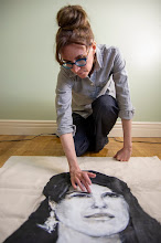
“…far from a tell-all memoir.”
The other night, I was in the biography section of The Strand in New York when I overheard a customer ask an employee how she had located a particular book. The employee explained that the bookstore’s system allows for multiple fields to be searched simultaneously and she had used publisher and author. The customer thanked her and said, “You’re so sweet.” If only all reference interviews were this pleasant! Interestingly, the new Denise Green biography I picked up for half price eludes bibliographic organization. In the introduction to Denise Green: An Artist’s Odyssey (2012, University of Minnesota Press), Ingrid Periz asks, “Where would it fit on a library shelf?” (p. 11). She elaborates on how it blurs genres: it’s part autobiography (Green has written or co-written only a third of the content) and part multi-authored biography, mixed with advice and art criticism, in a tone that vacillates between scholarly and chatty.
Contributor Peter Timmins writes, “…words remain the subservient partner to images” (p. 169) in Green’s practice but they are what interest me most, as much as her simplified renditions of everyday objects and fluid use of line are engaging. She’s a good writer—a case in point is the description, “the uncontrollable spread of colour which was India itself.” It’s no wonder the New York-based artist became editor of the feminist journal, Heresies and the equally radical Semiotext(e). What fascinates me is that she began writing about art with the explicit goal of becoming respected as an intellectual, to fight the gender bias facing artists. Her secondary purpose was to weigh in on how paintings were critiqued during the postmodern era governed by Clement Greenberg’s writing; she fought for critics to consider the subjective experience rather than interpreting works in a vacuum.
It’s ironic, then, that the book doesn’t delve too deeply into Green’s personal life. The chapters she has written, however, are far from a tell-all memoir. In part, this discretion may be the result of thematically arranged chapters like ‘the Paris years,’ meaning there is some jumping around (though not to the extent of Bob Dylan’s Chronicles Volume One). For example, she mentions that her alcoholic father had a car accident and in another passage, she concedes that one of her painting series stems from latent grief for him, but the reader never learns whether said accident was fatal. Nor does she disclose any details about the courtship leading to her second marriage. The majority of self-revelation is concentrated on her childhood in Australia and the family dynamics that prompted her to leave the country as a teenager. Periz is accurate in observing, “…Green the woman stays somewhat hidden” (p. 15). In a sense, this strategy allows the reader to focus—intermittently at least—on Green’s art independent on her gender, which is refreshing. Not surprisingly, the chapters written by her colleagues—primarily art critics, curators and gallerists sprinkled around the globe—focus on her extensive artistic contributions over the past 40 years.
Sunday, July 29, 2012
Monday, July 16, 2012
Better living through chemistry? Lise Melhorn-Boe's artist's books make you think twice
“... there’s a mindset
of, 'I don’t want to know this.'”
Now that her show, Endangered, is over in North Bay (where, incidentally, I’m moving next month), Kingston artist Lise Melhorn-Boe was free to chat about her work.
HS-Your show
at the W. K. P. Kennedy Gallery focuses on intense subject matter, like the
recent increase in deformed penises in babies attributed to chemical exposure
and the positive correlation between homelessness and multiple chemical
sensitivities. I swear my eyes started stinging right after reading your Toxic Face Book, which describes the
toxins found in common cosmetics. What kinds of reactions have you received in
relation to this body of work?
LMB- I have had a lot of positive feedback. Even people who thought they
knew a great deal about our environment told me they had learned something.
However, many people do think it’s depressing. I thought I was presenting the
material in a lighthearted enough way that it would take the edge off the
negativity. People are very interested but they’re not gaga over it like they
have been for some of my other work, especially my work about women’s lives
where they could really relate and wanted to share their own stories with me.
With this body of work, there’s a mindset
of, “I don’t want to know this.” Some of the information is very scary. It’s
maybe easier just not to know, so you don’t have to worry about it and you
don’t have to make choices, but art (or some art) is about making people think
and that’s what I’ve always tried to do.
HS- In your
artist books, it often feels like you could keep turning the pages forever to
read more and more dire statistics about the environment. Gypsy Moth was such a lovely read because the woman who almost died
after being dosed with pesticide designed to kill gypsy moth caterpillars gets
better at the end. How do you strike a balance between presenting dark subject
matter and giving people hope that they can change their ways and make a
difference?
LMB- As I said, I was coming at it [the subject matter] from a
lighthearted angle. (Laughs). It’s an interesting question and hope is
important. Because I was so overwhelmed by negative information, I wasn’t
feeling hopeful myself so it was hard to put that in the work. To be honest, sometimes
I am glad I am getting old. I’d be really depressed and angry if I were in my
twenties, knowing what is ahead of us. At this point in my life, I’m more
resigned and cynical.
HS-In terms
of making a difference, you don’t just walk the walk. Not only do you make art
about garbage, but you refuse to use plastic bags to line your own garbage can,
you pick up litter if it can be recycled, and I remember at White Water
Gallery, you would save up styrofoam that couldn’t be recycled locally so you
could recycle it when you went “down south” as the people of North Bay say.
Have you always been so environmentally conscious?
LMB- I made my first environmental project for a Man and Society class
in high school when I was seventeen, I think. (What a sexist name! They later
changed it to Society, Challenge and Change). It was a collaged book on
pollution. So yes, I’ve always been concerned about the environment and
involved in environmental groups. This is a timely question because it struck
me today that I’ve been riding a bicycle for 50 years.
HS- Today’s
protests in Ottawa by scientists angry about the federal government’s cuts to
funding for environmental protection underscore the precarious state of the
environment. If you could have the attention of Prime Minister Stephen Harper,
what would you say to him?
LMB- There’s a term, “precautionary principle,” which posits that it’s
better to be safe than sorry. At the moment, anyone can come up with a product
and market it and later say, “Oops, that was dangerous.” As a nation, we should
think strongly about what materials we’re introducing into our lives rather
than trying to mop up disasters in retrospect... and I’d tell him to forget
about the tar sands and to come up with a different plan.
HS- Text is
very prominent in your work. Which tends to come first: text or image?
LMB- In the past I would have said the text, definitely. When I was
working with women’s stories, the story birthed the form of the piece. I
interviewed women and used questionnaires, but for this body of work, the
responses I got from people were very negative and they weren’t good stories.
People were overwhelmed by their health issues and I was not inspired visually
by their stories. A story has to have a visual component to transform it into a
visual piece. I ended up doing more research in the library than usual, so a
lot of the text is factual as opposed to narrative. Maybe that’s why Gypsy Moth stands out. It has a
beginning, middle and end, and she [the subject] told it well. Pain started with the text, and in Happy Memories, those are all stories
from actual people.
Garbage [in which
she collected garbage for seven weeks—save for organic waste—and displayed one
week’s worth in each of the seven copies in the edition, each stored in a tiny,
adorable garbage can] started with the heavy duty plastic mesh bags which came
from the only organic produce that was available to me in North Bay. I thought
it was so incongruous. Since the store refused to take them back, I decided I
had to do something with them.
With this whole body of work, I was thinking of the environment as a
topic, so I was more aware than usual about my materials. I recycled materials
and I recycled ideas. Toxic Face Book
uses a leftover cast of a face from a feminist piece called Colour Me Dutiful that was too thin to
use at the time. What's For Dinner?
uses a similar format to two earlier books—I have often made work about food.
And I've used clothing a lot too, in the past, so the baby clothes in Endangered Species and the paper doll
clothes in Toxic Kids fit right into
my oeuvre. Endangered Species uses
PVC connectors I found while trying to find a sturdy way to construct a large
tunnel book in the shape of an ice hut for Ice
Follies, an art installation festival in North Bay where artists use ice
huts on the lake for installations. I was initially planning a piece about the
projection that Lake Nipissing [in North Bay] wouldn’t have ice in twenty
years, which would be about sixteen years from now. Then the idea morphed
because PVC is a really toxic material to create and it seemed perfect to talk
about the effect of toxins on babies.
HS-You have
an inventive approach to materials, like using a transparent overlay of fabric
to represent cheese on a pizza in the book, What’s
for Dinner? Do you have fun coming up with these visuals?
LMB- Oh, I have a lot of fun! For me, because it was so much fun making
this work that it overshadowed the negative content, I was taken aback when
people focused on the negative content over the visual presentation.
HS- You’ve
made pop-up books for a long time before your work took an environmental turn.
Do you find this format has a different resonance with this subject matter?
LMB- I’ve always used it for its playful character so it was deliberate
to pair some of these painful topics with this format to affect the tone.
Pop-ups are fun; I teach them to kids in classrooms. I was trying to add an
element of playfulness [with pop-ups in this body of work].
HS- What’s it
like to make explicitly personal work like Body
Map, where you show the interplay between health problems and the
environment, with text overlaying a
fairly sizeable photograph of your naked body?
LMB- Just recently, a woman I know who has had breast cancer told me I
was very brave and I was surprised because I’d never really thought of it that
way. I came up with the idea for Body Map
when I did a residency at Queen’s University. I thought about approaching a
student photographer but I chose to ask my husband to take the photos even
though he’s not a photographer. I’ve been to nudist colonies but I wasn’t
comfortable stripping in front of just anyone. Maybe there’s something
different about being photographed than walking on the beach. I think I might
have been hesitant to do something like that before I had cancer but having had
a mastectomy, I don’t feel quite as sexual as I once did, so it’s less
revealing personally. Besides, once the image is out there, I’m separated from
it.
No Safe
Levels also shows my naked body but I took artistic license with it. It’s a
pop-up and technically, I needed the right breast to pop up because it was on
the fold. That’s actually the one that was cut off, but I just switched them.
It’s much more abstract [than Body Map]
and not everyone realizes it’s my body.
HS- Can you
comment on one of the final images in Breast
Cancer Journal in which a figure floats through the sky, separated from but
seemingly drawn to, the earth?
LMB- It was the result of a meditation, something that came to me in a
vision. I think it’s me but why I’m floating out there I can’t remember. (Turns
the page). This one I had a vision of in a winter solstice ceremony. I saw my
breasts on fire. (Turns the page). And this is me holding up my child self and
coming back up to the light. (Turns the page). I’m holding myself and mothering
myself. It [making this journal] was all very positive. I debated about using
text in this piece but I decided I liked the mystery. It wasn’t actually
intended to be an art piece. A few people I showed the images to found them
powerful, so I thought, “Why not?” In a way, this is more revealing [than works
like Body Map]: this is my naked
psyche or naked soul rather than my naked body.
HS- Your
earlier work was very feminist. Is the relationship between our health and the
environment a feminist issue in your opinion?
LMB- It pertains to everyone but because women have more body fat than
men and toxins reside in body fat, in that sense, these toxins affect women
more, so that makes it a feminist issue. Also, women carry the next generation
and they say the best way to detox is to breastfeed, but that means passing the
toxins on to your baby. It was something I worried about when I breastfed.
(Looks at her son who coincidentally appeared in the stairwell at this moment).
For those reasons, it’s a really important issue for women.
HS- Lastly,
are there other environmental artists you admire?
LMB- This is going back a long time, but I was always very moved by Ana
Mendieta’s work. The way she put her body in the environment—there was such a
strong connection between her and the earth. I suppose that’s essentialist,
stressing the connection between women and the earth, and it annoys some
people, but if I had to choose a camp, that’s the one I’d fall into.
For images, see Transformer Press
This interview
took place on July 11, 2012 at Lise’s home.
Labels:
Ana Mendieta,
Heather Saunders,
Lise Melhorn-Boe
Saturday, July 14, 2012
The legacy of Judy Chicago
“…the Feminist Art Program, an experiment that tested the limits of education.”
On my final bus ride between Toronto and Kingston, I finished reading Entering the Picture: Judy Chicago, The Fresno Feminist Art Program and the Collective Visions of Women Artists (Routledge, 2012). Just as I read about artist Sylvia Savala’s father dictating what she should be when she grew up (legal secretary), just as I was thinking, “We’ve come a long way, baby,” a young man behind me barked at his girlfriend to shut up. I rotated my torso with exaggeration and glared icily. When he asked, “Can’t you just leave me alone and send me a [expletive] text?” I considered inviting her to sit beside me. I decided against it, not only because it could make things worse for her later, but because I too was vulnerable: as a woman travelling alone at night, arriving to a closed bus station with no one to meet me, I wasn’t about to take him on*. With regret, I state the obvious: there’s still a lot of work to be done.
Judy Chicago is a woman who knows how to get a lot of work done. Through the California Institute of the Arts, she facilitated Womanhouse, the first feminist installation by 26 female students, which graced the cover of TIME Magazine. She also spearheaded The Dinner Party, the first massive installation reflecting the vision of a single woman, which ended up debated in Congress. But before all that, at a state university campus in rural Fresno, California in 1970, she launched the Feminist Art Program, an experiment that tested the limits of education.
Chicago’s teaching method was the outgrowth of experiments she’d made along the way while teaching art part-time beforehand, like silencing all the men in the classroom so the women could be heard. The fifteen young women under her tutelage in the Feminist Art Program wore work boots and learned to renovate a studio as well as any man. The intuitive curriculum she fashioned promoted self-analysis using Simone de Beauvoir’s The Second Sex. Through consciousness-raising sessions, the women made leaps and bounds in their artistic development.
If this all sounds too good to be true, a little too much like Mona Lisa Smile—the film in which Julia Roberts plays an unconventional art history teacher who introduces her students to modern art and (in the process) feminism—then I’m not delving deep enough. The collective opinion of Chicago’s students was that the being in the program was incredible, but it was also risky. They got themselves into dangerous situations like interviewing rape victims in seedy neighbourhoods in the middle of the night for an audio work. Their emotional states were also at risk. Former students recall Chicago prying into their personal lives, but also pushing them away by insisting, “I’m not your mother!” and throwing a bottle of wine at the wall in one of their many group dinners. They were intimidated by her: one student admitted feeling pressured to make so-called vulvic art, a staple of Chicago’s oeuvre. Others embraced this trendy subject matter with aplomb; witness the CUNT cheerleaders. Having Chicago as a matriarch may have been a tumultuous experience, but her alumnae also recall her devotion to teaching and her generosity, like slipping a twenty dollar bill to a needy student and never expecting it back.
One thing is certain: Judy Chicago has made a major impact on women artists. One says she’ll never forget the time she heard her give a presentation, and another admits she treated her advice as if it had come from God. There are accounts from many women in this book, which is a collection of conference presentations for a symposium celebrating the 40thanniversary of the establishment of the program. Some of them knew Chicago very well, others interacted with her peripherally while engaged in parallel projects, and some were part of the next generation when Chicago moved the program to the California Institute of the Arts. We even hear from Chicago herself, who shares great anecdotes, like the San Francisco Museum of Art making so much money in the bookstore when The Dinner Party debuted that they bought a computerized cash registered and named it after her.
Reflective of conferences in general, some of the writing is superb, but some of the entries meander and trail off. All in all, though, it’s a good read.
*The following month, a similar situation arose and I did intervene by engaging the female and calling campus security. This time, the woman ignored me and the man told me to go (expletive) myself. It seems to be a losing battle.
Reflective of conferences in general, some of the writing is superb, but some of the entries meander and trail off. All in all, though, it’s a good read.
*The following month, a similar situation arose and I did intervene by engaging the female and calling campus security. This time, the woman ignored me and the man told me to go (expletive) myself. It seems to be a losing battle.
Labels:
Heather Saunders,
Judy Chicago,
Sylvia Savala
Sunday, June 10, 2012
Damsels in Distress
“He’s lying. I find that very attractive.” -- Violet Wistler
Sitting in the Westdale Theatre for Damsels in Distress (2011), as part of the Art Gallery of Hamilton’s I Heart Film series, I felt a twinge of irony because I wanted to be rescued. From this movie. Specifically from Violet Wistler (nee Emily Tweeter). Gerta Gerwig plays the self-righteous main character, Violet, whose outreach mission at Seven Oaks University on the east coast involves distributing soap to fraternities and donuts to suicidal students. Her vocabulary harks back to the days of Dawson’s Creek, when a professor friend of mind noticed particular terms seeping into students’ papers in unison, reflecting the improbable diction of Dawson, Joey, Pacey, and Jenn. The only way Violet’s doe-eyed roommate, Heather (Carrie MacLemore), would use the term ‘precocious’ is from hanging around her. Her other roommate, Rose (Megalyn Echikunwoke), is a childhood friend who backs her up consistently, always on the lookout for ‘playboy operators’ and non-suicidal students scamming free baked goods. While applying mascara, she muses, “If humility comes from within and you never had any, where are you supposed to find it? I gave up looking long ago.” Their new rommmate, Lily (Analeigh Tipton), a transfer student, enters their social circle and calls the group’s humility into question, provoking Violet to actually thank Lily for her chastising. She probably is grateful instead of embarrassed, because she would regard the opportunity for increased self-awareness as a gift.
The movie, directed by Wilt Stillman, starts out seeming like it might reverse the ‘damsels in distress’ stereotype. The young women attend a party with the intention of helping frat boys discover their potential under the tutelage of Violet. “There’s enough material here for a lifetime of work,” she remarks as one dude launches himself over a railing. Soon, though, the young women become swept away by young men who cause them to say such ridiculous things as, “He’s lying. I find that very attractive.” Heather dates a colour blind student who becomes panicked by rainbows, Lily falls for a friend whose supposed religion supposedly requires him to express his love physically “from the wrong side” and Violet considers—gasp—going to the library stacks on a date. The male-female dynamic isn’t really critiqued, because the only element that bears any resemblance to modern romance is the ethics of boyfriend stealing, from outright to seemingly unintentional. This female-female issue is not plumbed, as the secondary characters disappear as soon as the newer romance develops. Strangely, aside from Violet, all the characters feel like secondary characters and I found myself not really caring about the fate of their relationships, be they friendships or romances.
It’s also difficult to care about an overbearing character like Violet. At the same time, it’s hard not to respect Violet for rescuing herself from her funk when she is spurned by her beau, a frat boy she chose because he is unrefined. She walks in the rain alone, she sits in a diner alone, she checks into a motel alone (Motel 4 instead of Motel 6 because it’s cheaper and thrift is a virtue), and she dances alone before she dances with a new partner. An odd feminist, she implies that you can really only depend on yourself, even if your self is a fabrication, complete with an alias.
Sitting in the Westdale Theatre for Damsels in Distress (2011), as part of the Art Gallery of Hamilton’s I Heart Film series, I felt a twinge of irony because I wanted to be rescued. From this movie. Specifically from Violet Wistler (nee Emily Tweeter). Gerta Gerwig plays the self-righteous main character, Violet, whose outreach mission at Seven Oaks University on the east coast involves distributing soap to fraternities and donuts to suicidal students. Her vocabulary harks back to the days of Dawson’s Creek, when a professor friend of mind noticed particular terms seeping into students’ papers in unison, reflecting the improbable diction of Dawson, Joey, Pacey, and Jenn. The only way Violet’s doe-eyed roommate, Heather (Carrie MacLemore), would use the term ‘precocious’ is from hanging around her. Her other roommate, Rose (Megalyn Echikunwoke), is a childhood friend who backs her up consistently, always on the lookout for ‘playboy operators’ and non-suicidal students scamming free baked goods. While applying mascara, she muses, “If humility comes from within and you never had any, where are you supposed to find it? I gave up looking long ago.” Their new rommmate, Lily (Analeigh Tipton), a transfer student, enters their social circle and calls the group’s humility into question, provoking Violet to actually thank Lily for her chastising. She probably is grateful instead of embarrassed, because she would regard the opportunity for increased self-awareness as a gift.
The movie, directed by Wilt Stillman, starts out seeming like it might reverse the ‘damsels in distress’ stereotype. The young women attend a party with the intention of helping frat boys discover their potential under the tutelage of Violet. “There’s enough material here for a lifetime of work,” she remarks as one dude launches himself over a railing. Soon, though, the young women become swept away by young men who cause them to say such ridiculous things as, “He’s lying. I find that very attractive.” Heather dates a colour blind student who becomes panicked by rainbows, Lily falls for a friend whose supposed religion supposedly requires him to express his love physically “from the wrong side” and Violet considers—gasp—going to the library stacks on a date. The male-female dynamic isn’t really critiqued, because the only element that bears any resemblance to modern romance is the ethics of boyfriend stealing, from outright to seemingly unintentional. This female-female issue is not plumbed, as the secondary characters disappear as soon as the newer romance develops. Strangely, aside from Violet, all the characters feel like secondary characters and I found myself not really caring about the fate of their relationships, be they friendships or romances.
It’s also difficult to care about an overbearing character like Violet. At the same time, it’s hard not to respect Violet for rescuing herself from her funk when she is spurned by her beau, a frat boy she chose because he is unrefined. She walks in the rain alone, she sits in a diner alone, she checks into a motel alone (Motel 4 instead of Motel 6 because it’s cheaper and thrift is a virtue), and she dances alone before she dances with a new partner. An odd feminist, she implies that you can really only depend on yourself, even if your self is a fabrication, complete with an alias.
Saturday, May 26, 2012
Pink Ribbons, Inc.
“...
outright war on breast cancer, with your dollars are the ammunition.”
As an artist, I’ve spent a lot of time contemplating the
association between females and the colour pink, but these thoughts have never
strayed into the rich (literally) connection in breast cancer marketing. Sure,
I’d noticed some bizarre products like a pink plastic stapler resembling a
high-heeled shoe, but not the extent of this marketing extravaganza. Enter Samantha King, associate professor of
gender studies and kinesiology at Queen’s University, where she presented in
today’s MiniU conference.
In the introduction to her book, Pink Ribbons, Inc. (University of Minnesota Press, 2006), King ponders
what brought about the change in representations of breast cancer over time, by examining two New
York Times Magazine covers. A 1993 cover
with artist Matuschka revealing her mastectomy scar contains the
caption—incidentally, known in the publishing world as a ‘slug’—“You Can’t
Look Away Anymore. The Anguished Politics of Breast Cancer.” A 1996 cover,
meanwhile, features supermodel Linda Evangelista covering her breasts with her
arm and the caption, “This year’s hot charity.” Evangelista’s “hypernormal
femininity” (p. x) and chic portrayal of the disease were a sign of things to
come, but they weren’t the first in a series of marketing oddities.
Rewind to the early 1990s, when the pink ribbon originated.
It wasn’t always a pink ribbon. It was peach and it was the brainchild of
Charlette Hayley, who regarded it less as a brainchild and more as a sincere
gesture to bring attention to federal funding shortages for breast cancer
prevention in the US. When she declined an offer from Self magazine and Estée Lauder to partner with them in a
magazine issue devoted to breast cancer awareness, they appropriated it anyway.
Based on a lawyer’s advice, they changed the colour. “Colours are really
important,” King stresses, and focus groups revealed that pink denotes
qualities like lack of threat; certainly, it would be in corporations’ best
interests to avoid acknowledging the threat posed by breast cancer. King
thought at the time that “the pink ribbon would soon lose its lustre” but it seems
to have perpetuated this “insidiously gendered…cause-related marketing” (p.
xxiv). Pink is so closely linked with femininity (at least in the last 65 or so
years) that we are stopped in our tracks by breast cancer awareness campaigns
with slogans like, “Real men wear pink.” This particular slogan was used for a
partnership between the NFL and the Komen Foundation, which has notoriously flip-flopped its funding of Planned Parenthood (disturbingly since PP offers breast cancer screening). Men are generally excluded
from this pink marketing, which is problematic since they too are at risk of
getting breast cancer. King highlights the bizarreness of women receiving gifts
like pink bears when they are diagnosed, in contrast to men, who would not
receive, say, Matchbox cars when diagnosed with prostate cancer. Even products
that are associated with men can have a feminine version thanks to corporations
cashing in on the breast cancer awareness trend, most notably a handgun with an interchangeable pink grip. If you still don't think pink products are ubiquitous,
consider that the pink ribbon is featured on one of only two coloured Canadian
coins in history,
or that one of only two American stamps to be sold for higher than the letter
rate was part of a breast cancer awareness campaign. Since the
other Canadian coin commemorated war veterans and the other US stamp
commemorated 9/11, an outright war appears to be being waged on breast cancer, with your dollars
as the ammunition.
These marketing gimmicks wouldn’t be so perturbing if their
wording weren’t frequently misleading (noting, for example, that an unspecified
portion of proceeds goes to an unspecified charity); or if the same companies
didn’t put a cap on the money they donate to said charity; or if the dollar
amount donated per person weren’t so bleak. King gives the example of a yogurt
campaign that would require consumers to consume three large containers of
yogurt a day for four months to generate $36 in donations. Participating hardly seems
worthwhile, but who in the general population bothers to do the math?
It’s not just the products we buy that are pink. Coloured branding has
spread to our environment, with corporations competing over who will light up
the next major monument, be it a pyramid or the Eiffel Tower. Last year, I was
part of an art show called PINK that
involved local businesses in a small town outside Chicago creating pink window displays
simultaneously. It’s no wonder King has observed breast cancer patients
counting down the days on an online forum until the end of breast cancer month
(October) so they can escape the constant presence of pink and the
commoditization of their painful experience.
Adding insult to injury is the fact that the face of breast
cancer tends to be “youthful, ultra-feminine, and radiant with health” as well
as Caucasian. What, then, can we make of donut and fried chicken companies launching breast
cancer campaigns or cosmetics companies doing the same while continuing to
include known carcinogens in their products? They’ve been labeled ‘pink
washers’ by a San Francisco-based activist group.
If you think that participating in a walk-a-thon or
marathon is a better choice for helping in the fight against breast cancer,
you’ll be disappointed to hear that many of them have declared bankruptcy for
using phrasing trademarked by a major fundraising corporation. Or that in one
of the most high profile fundraisers with well-meaning participants celebrating
their own survival or honouring loved ones affected or killed by the disease, almost
one-third of the money raised was used for administration and marketing costs
as well as entertainment for the participants.
The film, Pink Ribbons, Inc. (2011, National Film Board of Canada) opens in the US on June 1st.
For a clip,
click here.
*a quarter, which was only distributed at a drugstore chain
Labels:
Heather Saunders,
Matuschka,
Samantha King
Tuesday, May 22, 2012
Nude PM portrait brings national media attention to library
“Here, the power dynamic is turned on its head.”
A week ago, it was only the locals who were talking about
Margaret Sutherland’s nude portrait of Prime Minister Stephen Harper in the
Kingston Frontenac Public Library, which is how I heard about it. By the
week-end, Googling ‘Harper painting Kingston library’ produced ten-plus pages
where every single result was about the controversy. On my lunch break today, I
headed over to 130 Johnson Street to see the arguably iconic portrait in
person.
The children’s librarian pointed me to the doorway where two
viewers lingered hesitantly before heading in to see Stephen Harper reclining
on a chaise lounge, without a stitch of clothing. I overheard one visitor say, “You
know what’s great about showing controversial work? It gets people in to see
the show.” A quick head count of fifteen people on a sunny Tuesday at lunchtime
suggests that this is indeed true.
In the same way that Charles Pachter’s paintings of the Queen on a moose elicited hostile reactions 40 years ago, Sutherland’s portrait has provoked extreme feedback, ranging from hilarity to disgust. My husband and I debated when the last time was that a painting caused as much commotion in the Canadian media as Sutherland’s Emperor Haute Couture (2011). His suggestion was the National Gallery of Canada’s 1989 acquisition of Voice of Fire (1967) by American artist, Barnett Newman. In contrast to that scandal, it’s exciting that the present discussion has stemmed from a female Canadian artist, while also highlighting the role of libraries beyond collections of books.
Satirical artistic representations of politicians have a
long history with caricatures, so what is it about this painting that is so
startling? Is it its realism and his sheer nudity? Harper’s sex organs may be
visible, but it’s not a sexualized painting. It brings to mind a comment by performance artist Stuart Ringholt in relation to his recent tour of
the Museum of Contemporary Art Australia where guide and guests were required to be naked:
“We are sexualized with our clothes on—with them off, we are not” (1). Sutherland’s portrait is hardly titillating,
with Harper’s patchy chest hair and slight paunch. The background composed of figures in neutral business suits creates a drab setting that runs counter to idealism. It’s
telling that the portrait is covered in a different fashion than Gustave
Courbet’s L’Origine du Monde (1866), a painting where female genitalia is the focus. It
was screened for a private peepshow, whereas Sutherland’s portrait is draped
during children’s programming. Here, the power dynamic is turned on its head:
after centuries of women being painted nude by men, Sutherland disrupts the
gaze that has been in the male domain for so long. Harper meets the viewer’s
gaze, but curiously, his expression seems apathetic and less forceful than the
gaze of the dog resting by his feet.
Andrew MacDougall, Harper’s new communications officer,
tweeted disdain for the portrait, noting that Harper is a cat person (2). Since
this is common public knowledge, Sutherland’s choice of dog seems purposeful.
While symbolism isn’t reigning supreme these days, the fact that the artist has
acknowledged Edouard Manet’s Olympia (1863) as a source of inspiration gives
the green light to consider symbols in historical works like Jan van Eyck’s The
Arnolfini Portrait (1434) and Albrecht Durer’s Melencolia (1514). In these works, the dog symbolizes fidelity, which is fitting considering that Sutherland cites among her frustrations with Harper cuts to arts funding, census-taking procedures, and prison closures.
The Tim Hortons cup passed to Harper on a china plate by
the sole female in the background is also reportedly symbolic (representing the
common folk of Canada). It also reinforces the Canadian-ness of the painting: Tim Hortons is so integral to our national identity that its Olympic
advertising is unforgettable but American locations feel the need to specify that
it is a coffee and bake shop. As product placement, it also
serves as a reminder of political branding and last year's public outcry that followed
the discreet switch in federal government communications from ‘the Government of Canada’ to ‘the
Harper Government’. All seriousness aside, I had to laugh when I looked down at the Tim Hortons drink I picked up spontaneously on my way back
to work and realized the probable cause of my detour.
The Kingston Arts Council's Juried Art Salon, of which the painting is part, runs
until May 30. If you are in the area, be sure to cast your vote for best in
show.
Works referenced:
http://www.musee-orsay.fr/index.php?id=851&L=1&tx_commentaire_pi1[showUid]=125&no_cache=1
http://www.nationalgallery.org.uk/paintings/jan-van-eyck-the-arnolfini-portrait
Sources:
(1) As cited by Mark Whittaker, “New Tour at Museum
Reveals All,” The New York Times, May 1, 2012.
(2) Andrew MacDougall @PMO_MacDougall On the Sutherland painting: we're not
impressed. Everyone knows the PM is a cat person. [Twitter post]. May 18, 2012.
Friday, April 13, 2012
Art ? Craft
“...what about the need for art to come to craft?” -- Isidora Spielmann
Before heading to The Mansion in Kingston for a panel discussion entitled Art ? Craft yesterday, I happened to read an article on this very topic in the spring newsletter from MAWA (Mentoring Artists for Women’s Art, Winnipeg). In ‘No More Bins,’ a reference to Laurie Anderson’s eschewing of unnecessary categorization, author and craft-based artist Heidi Eigenkind says her “deep seated aversion to binary structures” (1) surfaces when someone makes a comment like ‘some potholders are just potholders.’ It’s interesting that some people can see the distinction between art and craft so simply while others—like last night’s panelists from the Organization of Kingston Women Artists, Diane Black, Margaret Hughes, and Isidora Spielmann—are struck by the complexity of their relationship.
Margaret Hughes observed that art and craft are starting to merge again, reminding us of their parallel status and professional integration in the Middle Ages and the Renaissance. I have to agree; as I wrote in a post about a textiles show at Project Space last fall, “craft and art have become rather comfortable bedfellows.” What does it mean, though, when someone can’t admit who they’re sleeping with? What does it say about me that the first time I crossed the border with my textiles sculptures, I referred to them as ‘craft’ rather than ‘art’ even though I have always thought of them as the latter? On a subconscious level, I must have assumed the customs official would be more willing to approve their admission to the US. And I’m sure I’m not the only fibre artist who has hesitated about responding to a call for submissions for a craft show because of how it will affect the perception of my art long-term. These examples suggest that the art/craft question is not an inconsequential one.
Isidora Spielmann noted that it’s common to talk about the need for craft to come to art, but what about the need for art to come to craft? Damien Hurst was cited as an example of a conceptual artist who is relatively divorced from the process of making. It brings to mind Mira Schor writing in Wet (Duke University Press, 1997) that all artists can’t seriously go “back to scraping sheet gut every time you need a sheet of tracing paper.” (2) Yet there’s something inspiring about Margaret Hughes having built not one but two kilns by hand and Diane Black being a modern day blacksmith. Schor has a good point when she says it wouldn’t be a terrible fate if painting, long the golden child of the art world, were to become ‘relegated’ to the realm of craft.
All three artists have approached a variety of media with fervour, aiming to perfect their technique and to infuse their work with meaning. They’ve switched between art and craft over time, and they feel comfortable in both worlds. What can we make of hybrid examples like Spielmann’s couture garments on which she has painted by hand, or of Hughes’ inclusion of her own pots in her still lives? The waters are muddy indeed, which poses a challenge for art librarians like myself in terms of cataloguing images, but it’s exciting to see this cross-over. Clearly, these are artists to whom the dismissive statement, ‘some potholders are just potholders’ does not apply.
Sources:
(1) p. 5.
(2) p. 185.
Before heading to The Mansion in Kingston for a panel discussion entitled Art ? Craft yesterday, I happened to read an article on this very topic in the spring newsletter from MAWA (Mentoring Artists for Women’s Art, Winnipeg). In ‘No More Bins,’ a reference to Laurie Anderson’s eschewing of unnecessary categorization, author and craft-based artist Heidi Eigenkind says her “deep seated aversion to binary structures” (1) surfaces when someone makes a comment like ‘some potholders are just potholders.’ It’s interesting that some people can see the distinction between art and craft so simply while others—like last night’s panelists from the Organization of Kingston Women Artists, Diane Black, Margaret Hughes, and Isidora Spielmann—are struck by the complexity of their relationship.
Margaret Hughes observed that art and craft are starting to merge again, reminding us of their parallel status and professional integration in the Middle Ages and the Renaissance. I have to agree; as I wrote in a post about a textiles show at Project Space last fall, “craft and art have become rather comfortable bedfellows.” What does it mean, though, when someone can’t admit who they’re sleeping with? What does it say about me that the first time I crossed the border with my textiles sculptures, I referred to them as ‘craft’ rather than ‘art’ even though I have always thought of them as the latter? On a subconscious level, I must have assumed the customs official would be more willing to approve their admission to the US. And I’m sure I’m not the only fibre artist who has hesitated about responding to a call for submissions for a craft show because of how it will affect the perception of my art long-term. These examples suggest that the art/craft question is not an inconsequential one.
Isidora Spielmann noted that it’s common to talk about the need for craft to come to art, but what about the need for art to come to craft? Damien Hurst was cited as an example of a conceptual artist who is relatively divorced from the process of making. It brings to mind Mira Schor writing in Wet (Duke University Press, 1997) that all artists can’t seriously go “back to scraping sheet gut every time you need a sheet of tracing paper.” (2) Yet there’s something inspiring about Margaret Hughes having built not one but two kilns by hand and Diane Black being a modern day blacksmith. Schor has a good point when she says it wouldn’t be a terrible fate if painting, long the golden child of the art world, were to become ‘relegated’ to the realm of craft.
All three artists have approached a variety of media with fervour, aiming to perfect their technique and to infuse their work with meaning. They’ve switched between art and craft over time, and they feel comfortable in both worlds. What can we make of hybrid examples like Spielmann’s couture garments on which she has painted by hand, or of Hughes’ inclusion of her own pots in her still lives? The waters are muddy indeed, which poses a challenge for art librarians like myself in terms of cataloguing images, but it’s exciting to see this cross-over. Clearly, these are artists to whom the dismissive statement, ‘some potholders are just potholders’ does not apply.
Sources:
(1) p. 5.
(2) p. 185.
Subscribe to:
Posts (Atom)