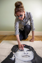
“Maybe we can’t draw flesh from reverie...” ~ Patti Smith
Cameron Armstrong, my fellow White Water Gallery board member over the past year, died unexpectedly in March at the age of 47, shortly before his solo show was scheduled to open at Ferneyhough Contemporary in North Bay, Ontario. The family’s wish was for over over (April 1-19) to proceed—an excellent choice and a fitting tribute, judging by the nearly impenetrable crowd at the opening.
Gallerist Joan Ferneyhough describes Armstrong’s style as a “layered approach” involving “several ongoing images.” (1) In 2007, Armstrong explained that his work features a combination of graphic and painterly imagery, with the former acting as a counterpoint. (2) To elaborate, typically in Armstrong’s paintings, the majority of the canvas is consumed by a close-up of a face, an object or objects (sometimes a still life), or a scene from nature. These dominant images tend to be rendered in grey and white or an understated combination of colours, in a painterly style reminiscent of Gerhard Richter. The muted palette and loose application of paint infuse his work with an ephemeral quality. The dominant images “reveal themselves slowly,” says Ferneyhough. They feel like they could dissolve if it weren’t for the presence of virtual anchors. Functioning as anchors—or perhaps ‘stabilizers’ is a better term—are tag-like markings; scribbles; dribbled paint (evocative of abstract expressionism); lines (both diagrammatic lines and those that feel excerpted from hard edge painting); cartoon-like elements; and representational images, such as a contoured crowd scene recalling Peter Max’s Yellow Submarine illustrations. Ferneyhough says, “It’s like he had this mental stockpile of images from 70s television and he continually drew from that.”
Also in 2007, Armstrong noted that the anchoring elements were the starting point for his work. (3) Although they are small, they feel like they have elbowed their way to the surface of the painting. Compared to the larger image consuming the majority of the canvas, they appear more finished, with thick outlines and punchy contrast. Because of placement and finish, they push the focal point backward, and what might otherwise be considered the foreground becomes the background. Meanwhile, because the largest image is depicted close-up, three-dimensionality gives way to two-dimensionality, compromising the recession of space. Effectively, Armstrong collapses the picture planes, continuing the cubists’ quest from over a century ago in a most intriguing manner.
Art historical connections date back much farther than last century. Like marginalia on illuminated Medieval manuscripts, these “‘pseudo abstract’ portions emerging from the sides” (4) as Armstrong described them, act as curious interjections. For example, Ferneyhough says of the tag-like elements in Armstrong’s paintings, they prevent the work from becoming “too precious.” Having lived with a painting of Armstrong’s for the past decade—a sideways portrait of Patti Smith (who was a key influence for Armstrong)—I have found the visual anchors to be a source of constant surprise. When I try to picture the work precisely, inevitably, some detail eludes me. I suspect it’s because the multiple components compete for my attention when viewing the work and the multiple components compete with my memory later on. The inability to keep the entire work in my mind’s eye is a metaphor for the glut of images we encounter in the era of Pinterest. On a more somber note, it speaks to the role of memory in grief. When I was working at WWG and Armstrong’s father died, I shared with the artist how surprisingly vivid my dreams were of my deceased father, and I let Armstrong know that I wished the same for him. Vivid, precise: if only they were one and the same. But to quote Smith, “Maybe we can’t draw flesh from reverie nor retrieve a dusty spur, but we can gather the dream itself and bring it back uniquely whole.” (5)
Recently, the artist had revealed to WWG director, Serena Kataoka that he was experimenting with reversing his process. (6) One can assume that he meant the equivalent of swapping ‘bring to front’ with ‘send to back,’ in Adobe Photoshop parlance. Whether the totality of images in a single work was planned in advance throughout his oeuvre, Ferneyhough says, “I suspect that he let the paintings take him where they wanted.” Where this new approach would have taken him, unfortunately, we can only imagine.
The closing date has been extended to April 22.
Images:
Armstrong in his studio, 2004. Courtesy of Liz Lott.
The Viewmaster General, 2014, oil on panel, 42 x 42 inches. Courtesy of Ferneyhough Contemporary.
Sources:
(1) All quotations of Joan Ferneyhough: personal communication, 8 April, 2017.
(2) “Close your eyes around me” statement, Oct. 2007. Although Armstrong states that this is his approach from that point in time onwards, these statements arguably apply to previous works as well.
(3) A Retrospective of North Bay and Surrounding Areas, http://www.virtualmuseum.ca/sgc-cms/histoires_de_chez_nous-community_memories/pm_v2.php?id=story_line&lg=English&fl=0&ex=00000300&sl=9707&pos=1
(4) Ibid.
(5) Smith, Patti. M Train, 2016, p. 251.
(6) Kataoka, Serena. Personal communication, 10 April, 2017.
Subscribe to:
Post Comments (Atom)


No comments:
Post a Comment